The redesigned Animal Kids Camp identity, ready for shirts, signage, and web.
A playful logo redesign for Animal Kids Camp — taking an existing mark and refreshing it into a friendly, energetic identity built for a young audience and the parents who sign them up.
Animal Kids Camp came in with an existing logo that no longer matched the energy of the program. A redesign like this is its own challenge: you have to honor what people already recognize, while fixing what holds the mark back — clarity at small sizes, friendliness, and a personality that lands with kids without losing the parents.
My job was to keep what worked, lose what didn't, and deliver a clean, scalable identity the camp could put on everything from t-shirts to a website header.
The redesign kept the camp's animal-and-kids spirit but rebuilt it for legibility, warmth, and real-world use.
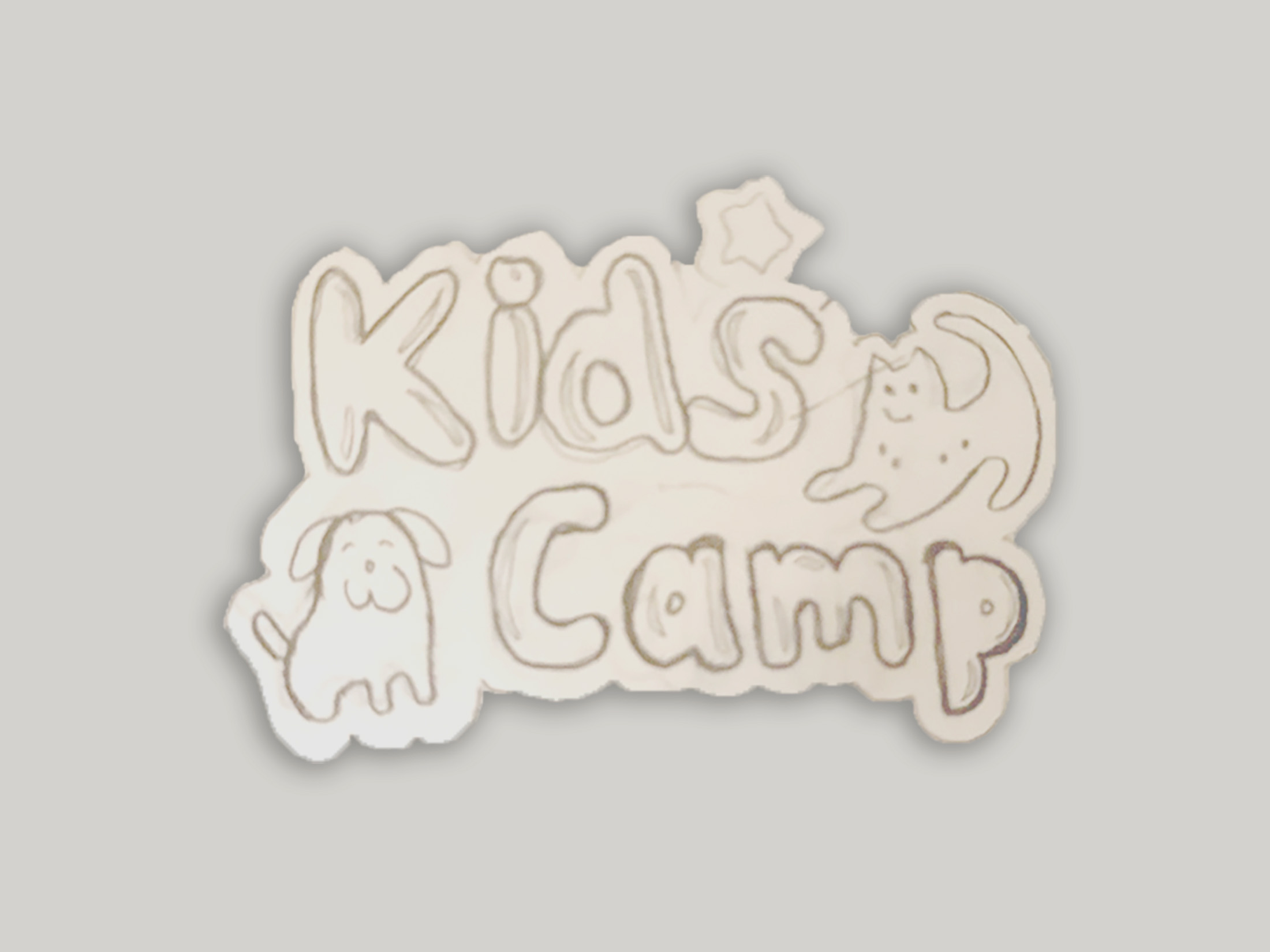
The starting point — recognizable, but dated and hard to read small.
Friendlier, cleaner, and scalable — built as true vector for any application.
I worked the character and composition by hand first — finding a friendly, approachable feel that fits a kids' camp without tipping into cliché. Drawing it out by hand keeps the warmth that vector-from-scratch work can lose.
I translated the approved direction into clean vector art with a bright, playful palette that holds up on apparel, signage, and screen. Final files were delivered print-ready in every variant the camp needed.
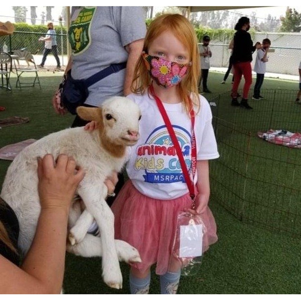
The same logo carried onto apparel — proof the mark holds its warmth and legibility off-screen, on the kind of camp t-shirt a kid actually wears.
The camp got a refreshed mark that reads clearly at any size and feels genuinely fun — and the engagement earned a five-star review.
I redesign logos that need new energy — hand-drawn for warmth, rebuilt as clean vector, and delivered ready for shirts, signs, and screens.
Start a project