Production-ready print across every format — from a 48-foot billboard to direct mail and packaging — alongside full brand systems for service businesses and nonprofits, hand-drawn and digital illustration, book covers, and editorial layout. Craft across channels and clients, grounded in real production knowledge.
Production-aware design across out-of-home, direct mail, packaging, event, and large-format work.
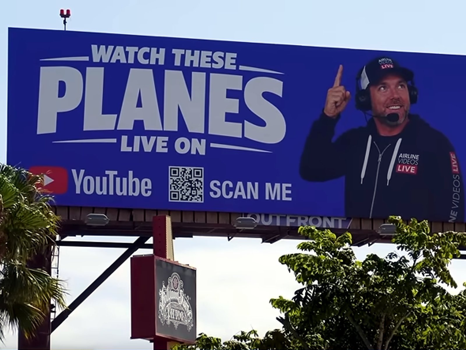
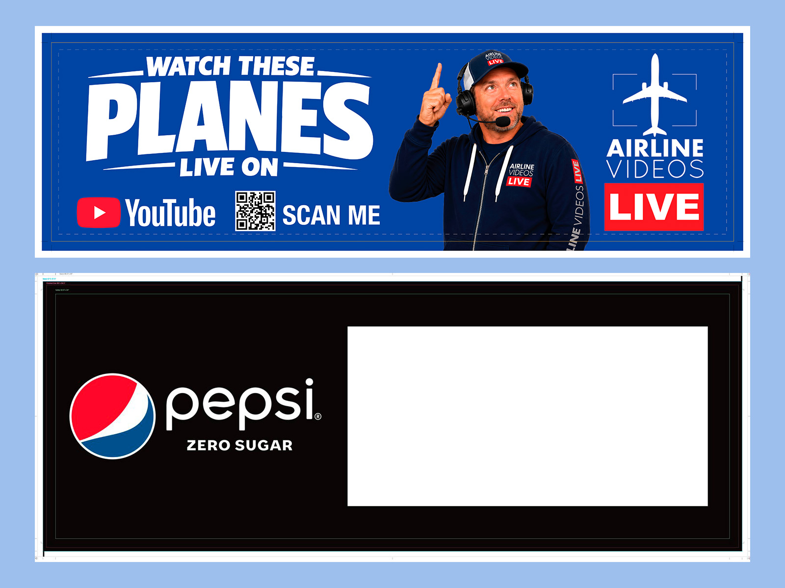
A 14×48 ft board built to OUTFRONT's spec: a raster title redrawn as vector, an RGB blue rebuilt so it printed royal instead of purple, and a press package that went straight to the printer. It went up in Los Angeles, and the client extended it through year-end.
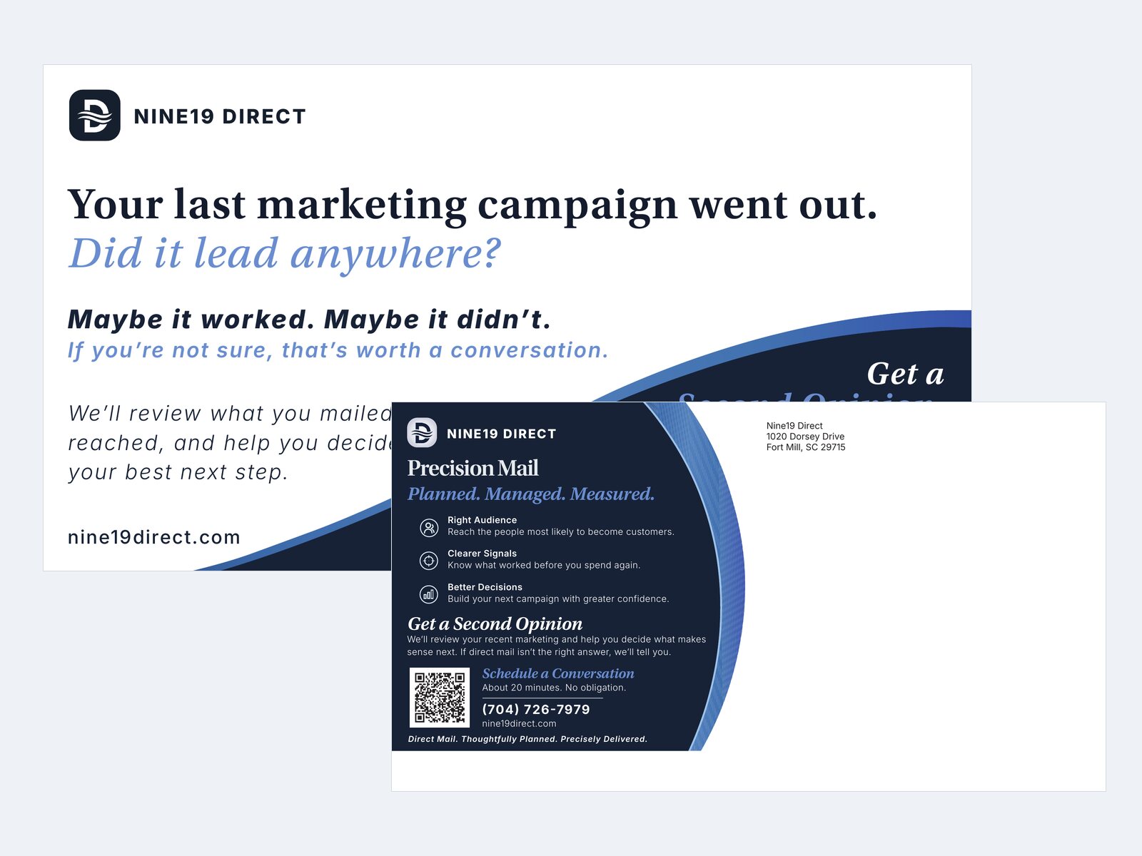
View case study →A 6×11 mail card designed end to end for a direct mail consultancy — offer strategy, five explored directions, and press files built around USPS automation rules. Signed off by the mail house as good for printing.
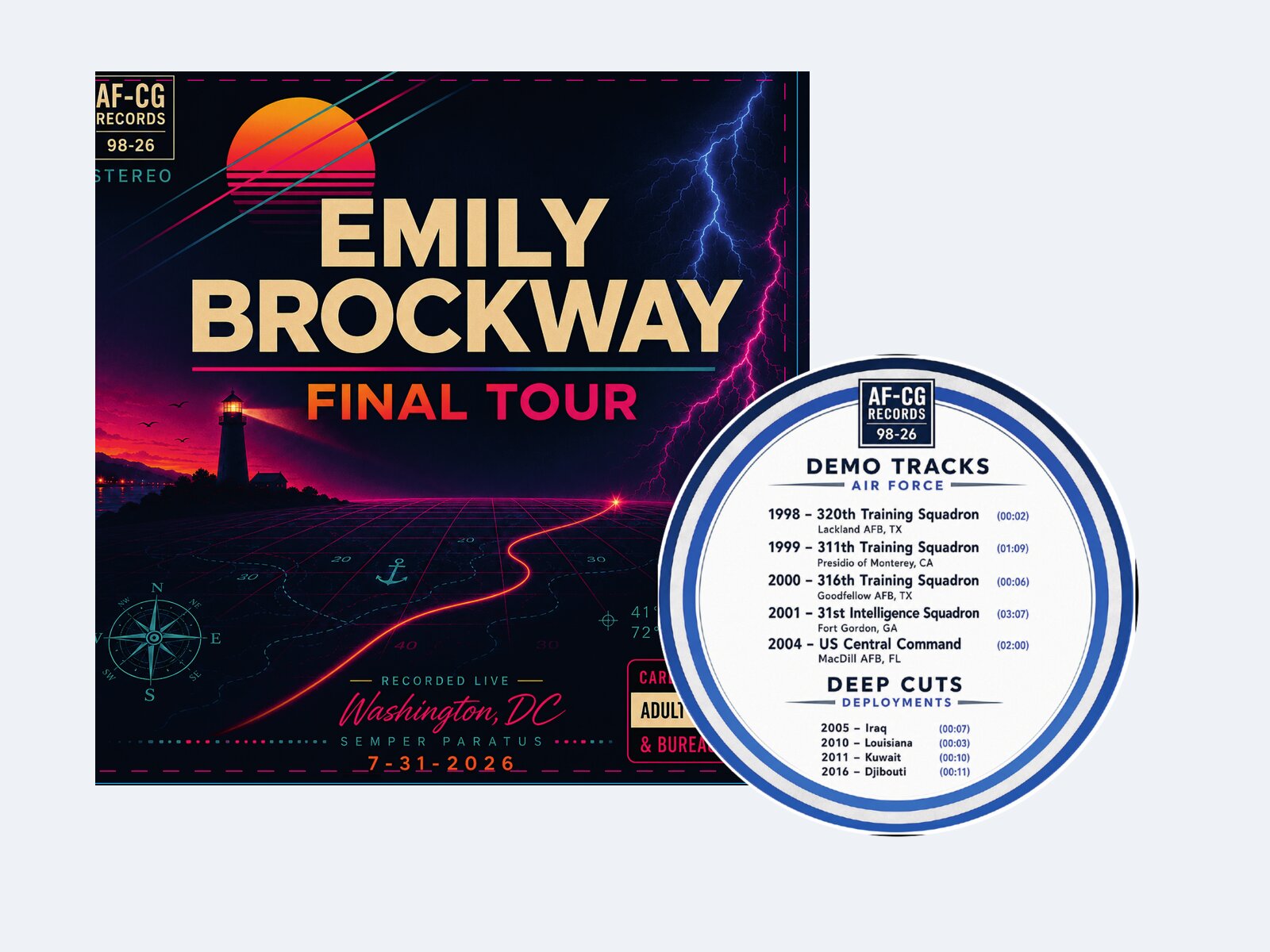
View case study →A ceremony program built as a real printed record — jacket and two die-cut labels adapted to a manufacturer's dieline under a strict no-redesign mandate, with an annotated proof that caught the questions before press.
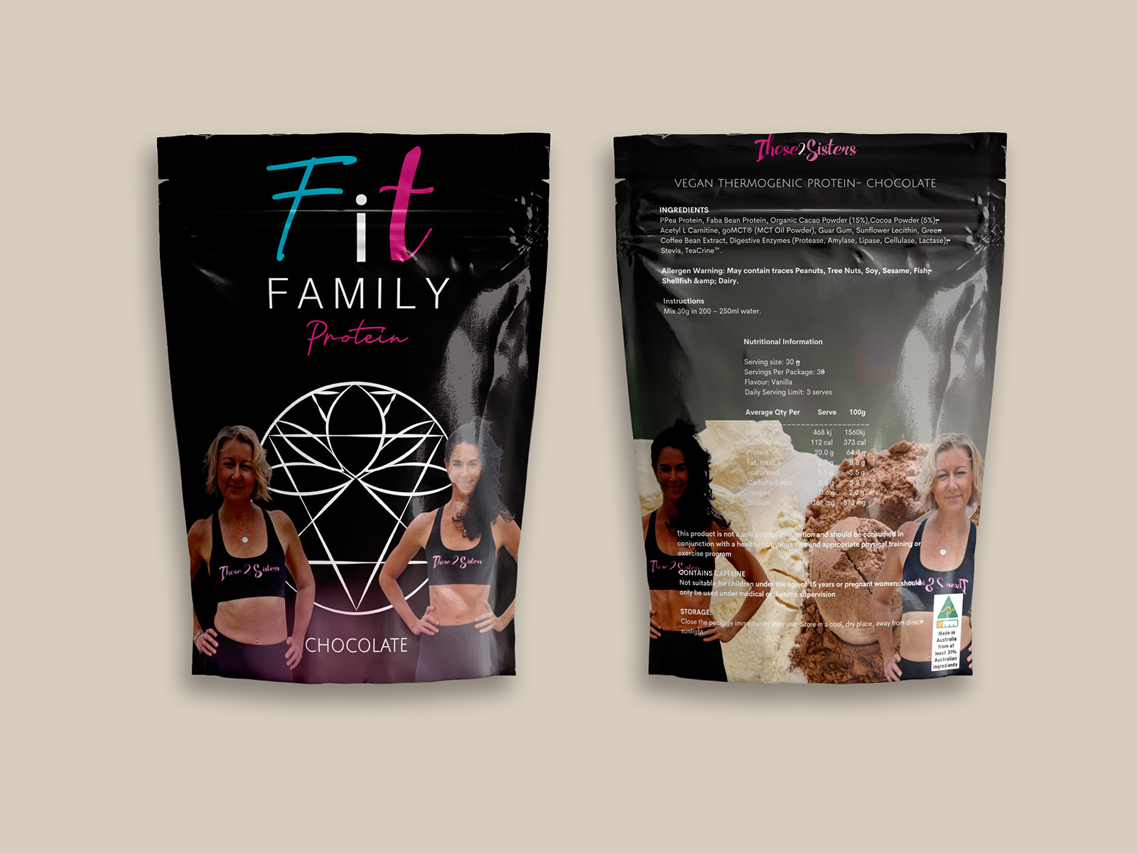
View case study →Retail packaging for a two-flavor protein line — front-of-pack branding and a full regulatory back panel, built as a single print-ready pouch dieline with seal lines, bleed, and trim marks.
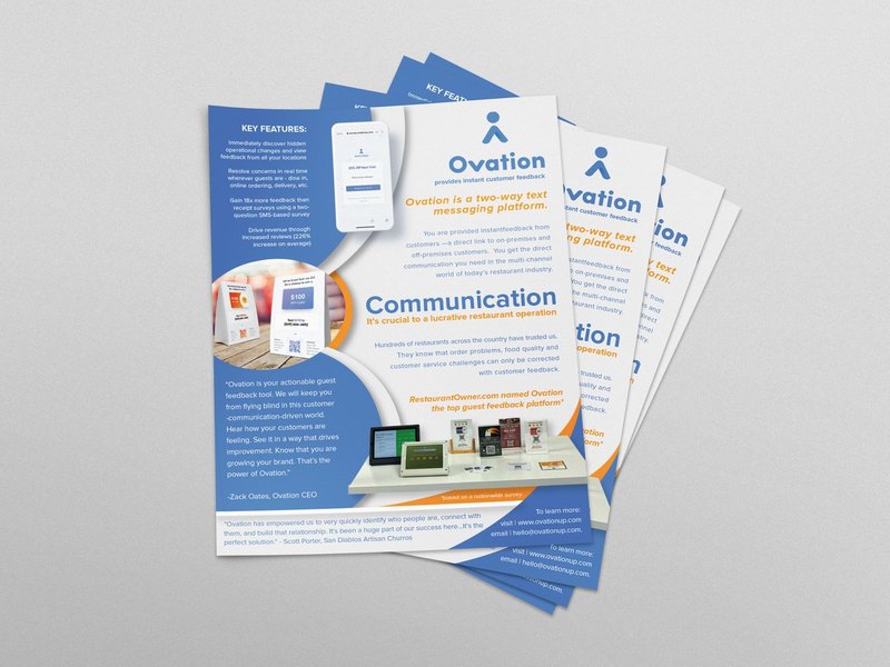
View case study →Commercial print work built on production credibility — hierarchy, brand-color systems, and press-ready CMYK at 300dpi with bleed and crop marks, across flyers, guides, and promotional pieces.
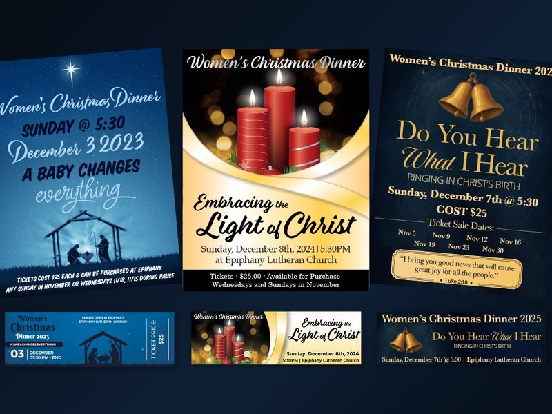
View project →Three consecutive years of a Women's Christmas Dinner — a fresh identity each season that still reads as the same recurring event, plus seasonal art-program collateral. Retention, range, and reliability in one project.
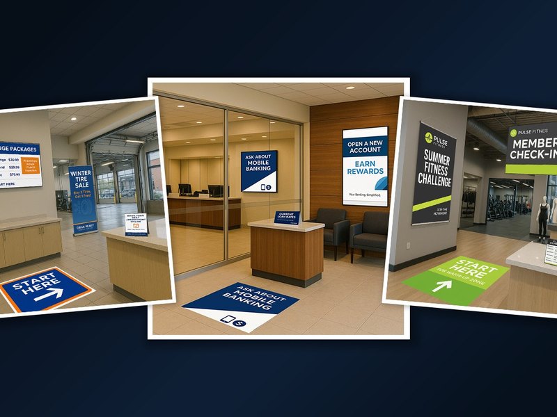
View case study →Print-ready artwork across yard signs, posters, banners, and retractables — created for WooCommerce store fulfillment and client campaigns, with full production-file preparation.
View project →The engineering beneath the print — die-line, bleed, safety, and score systems with a scalable legend, live client press proofs, and cut-file-to-product workflows from case cards to a 14-foot billboard.
View case study →Logo and identity systems built to hold up across every application.
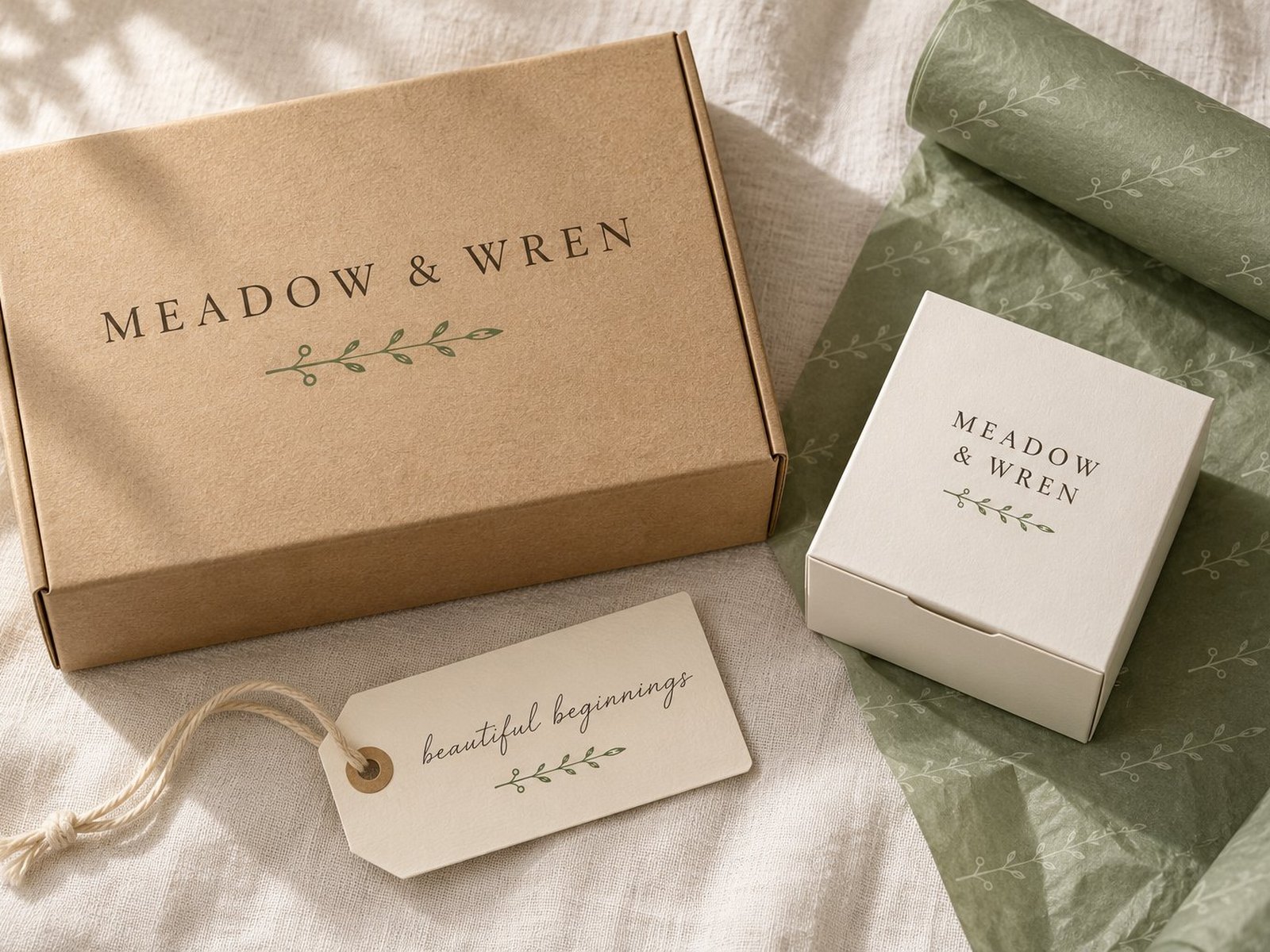
A brand that existed only as raster images inside mockups, faithfully redrawn as a nine-variant vector suite — hand-traced script, three colorways, four formats, and Pantone matching for print and fabric.
View case study →A research-led, hand-drawn logo for a planned-giving program inside Acadia National Park — from a single sharp question to an adopted, printed vector mark.
View case study →A playful logo redesign — taking an existing mark and refreshing it into a friendly, scalable identity built for a young audience. A five-star reviewed engagement.
View case study →A full brand identity for a new landscaping business — logo, color system, and print deliverables from business cards and letterhead to yard signs, vehicle magnets, and a tri-fold brochure.
View project →A program logo built to live inside a parent nonprofit identity — echoing the Bethlehem Center's butterfly and palette while standing on its own with a custom Chattanooga skyline. Brand-system thinking, delivered to a happy client.
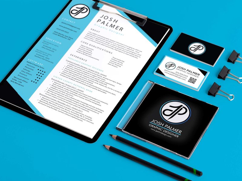
View case study →A complete self-directed identity system — logo, palette, type, business card, letterhead, and resume — built as my SNHU Graphic Design capstone and unified by consistent color and typographic discipline.
View case study →Hand-drawn and hand-colored — book covers, the outdoors, and historical restoration. No AI.
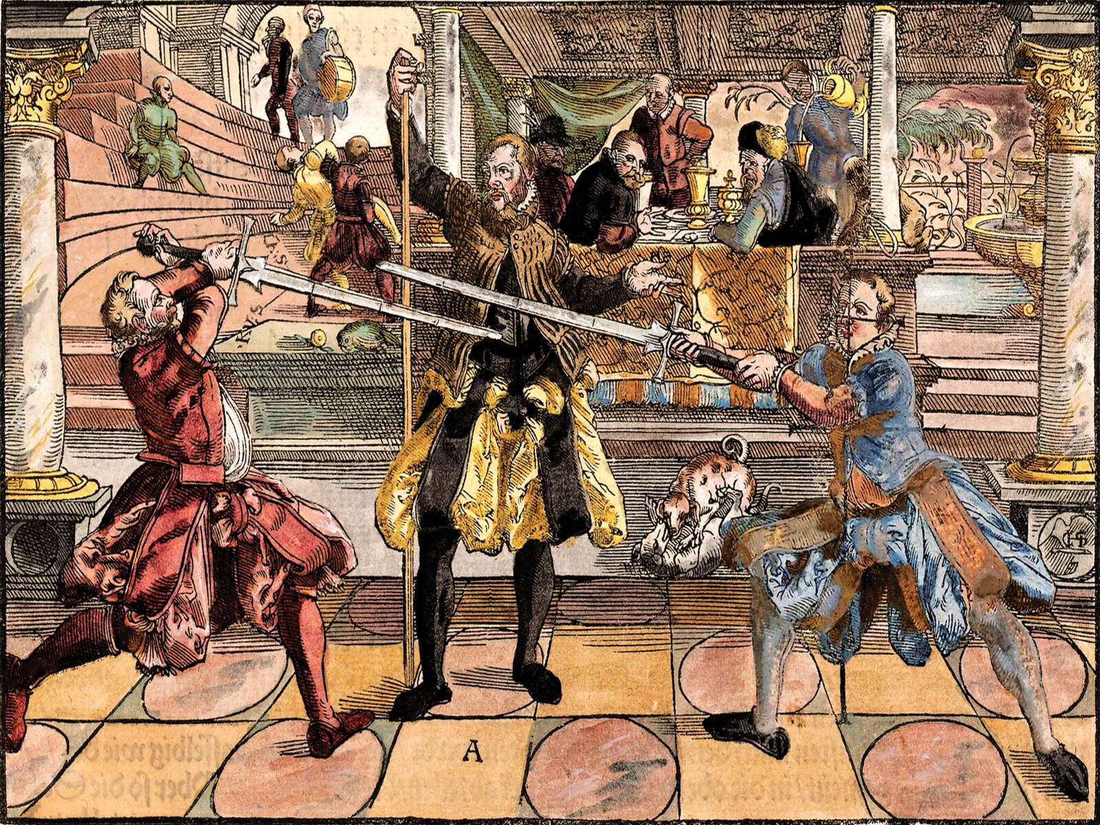
A plate from a 1570 fencing treatise restored for UV printing — hand-masked colour beneath preserved block-cut line work, at a client's explicit request for no AI colorization.
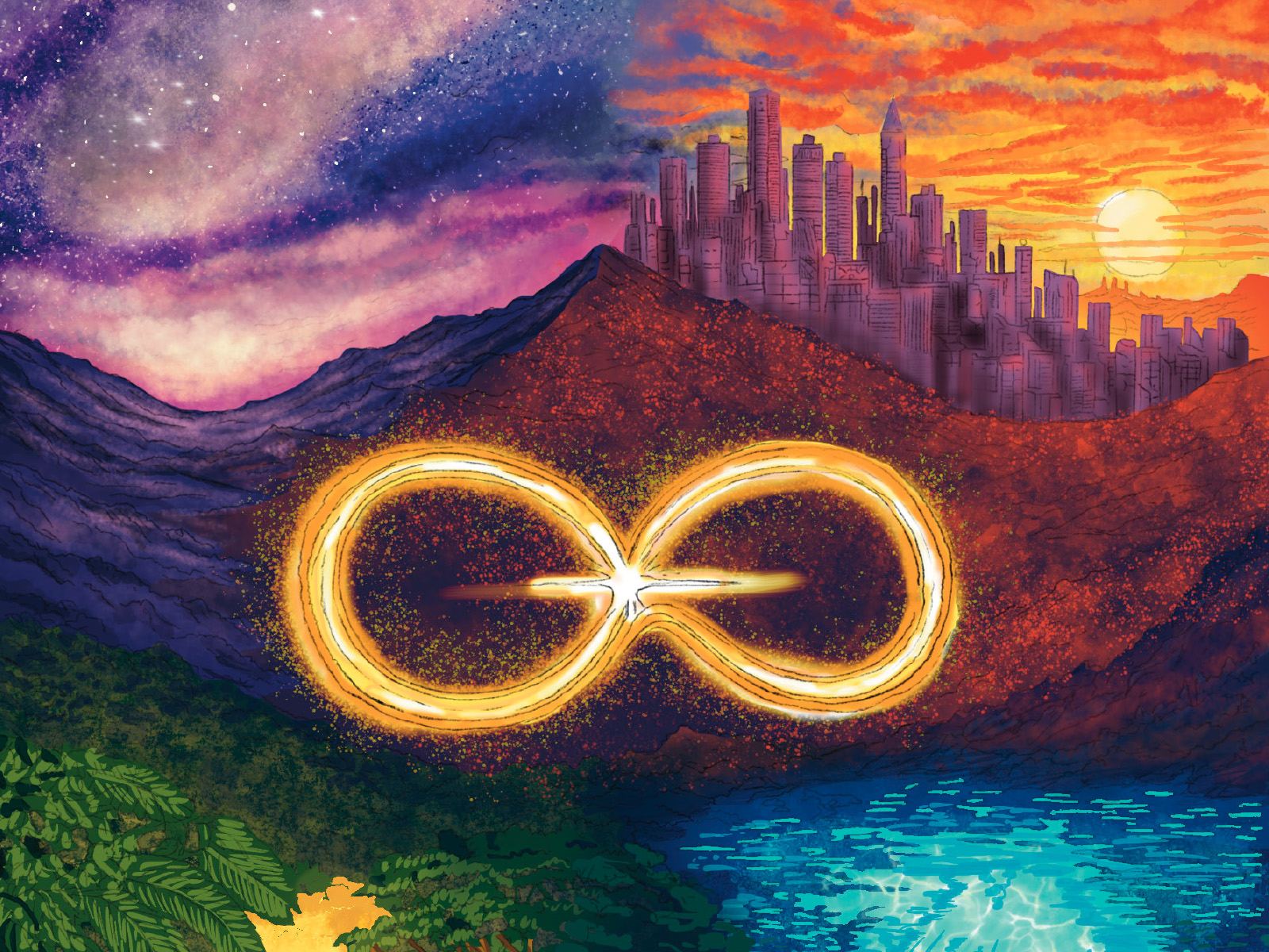
View case study →Illustrated front and back cover for an independently published novel — a cosmic landscape spanning cityscape, mountains, and forest, unified by a glowing infinity motif.
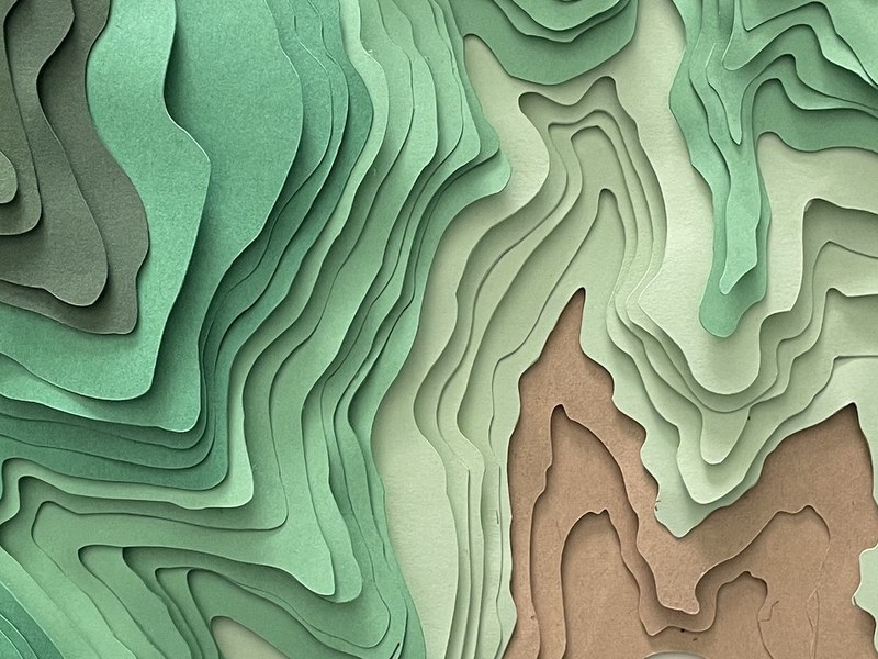
View project →An original Procreate topographic illustration separated into SVG contour layers, cut on a Cricut, and hand-assembled into a dimensional layered shadowbox — a full digital-to-physical workflow.
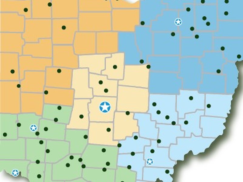
View case study →An original vector infographic of all 75 Ohio State Parks, drawn county by county and built into an interactive region explorer — click a region to see its parks, track completed and ready-to-visit stops, and tie in place-based artwork.
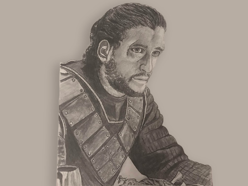
View case study →A range of original illustration — graphite portraits, a national-park landscape series, digital painting, and lettering. Every piece hand-drawn and digitized by hand, no AI.
View case study →Team badges and club designs — hand-drawn marks built for print and embroidery.
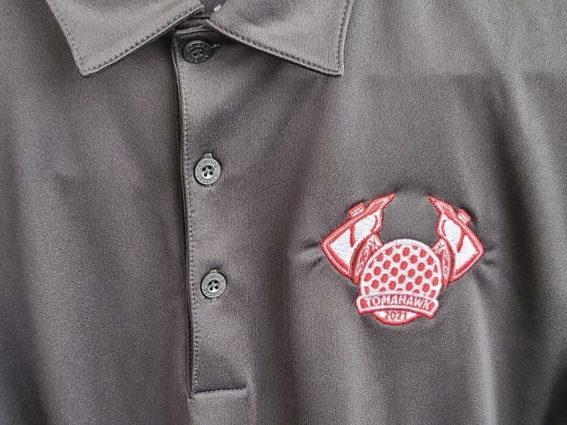
A crossed-axe team badge carried the full distance — pencil concept to clean vector to a finished left-chest embroidery on a real polo. A complete sketch-to-stitch workflow, no AI.
View case study →
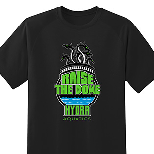
Spec and club designs across sports and community groups — Hydra Aquatics, Raiders, Animal Kids Camp, the F.O.R. Club, and more. Bold, screen-print-ready artwork built to wear — including the two-sided F.O.R. Club “Chain Reaction” shirt.
See the range →Print-ready file preparation across digital, screen, offset, and large-format — four-plus years of production discipline.
Multi-page brochures, event collateral, marketing materials, and museum-inspired layouts with strong typographic discipline.
Full identity systems, logo development, brand guidelines, and stationery suites for service businesses and nonprofits.
Hand-drawn and digital illustration in Procreate and Adobe CC — book covers, commercial work, and outdoor-inspired personal projects.
The UX page covers the Meridian Beverage Co. platform, web-to-print platform testing and architecture, and content design for regulated environments.
View UX Work →