Project · Packaging & Prepress
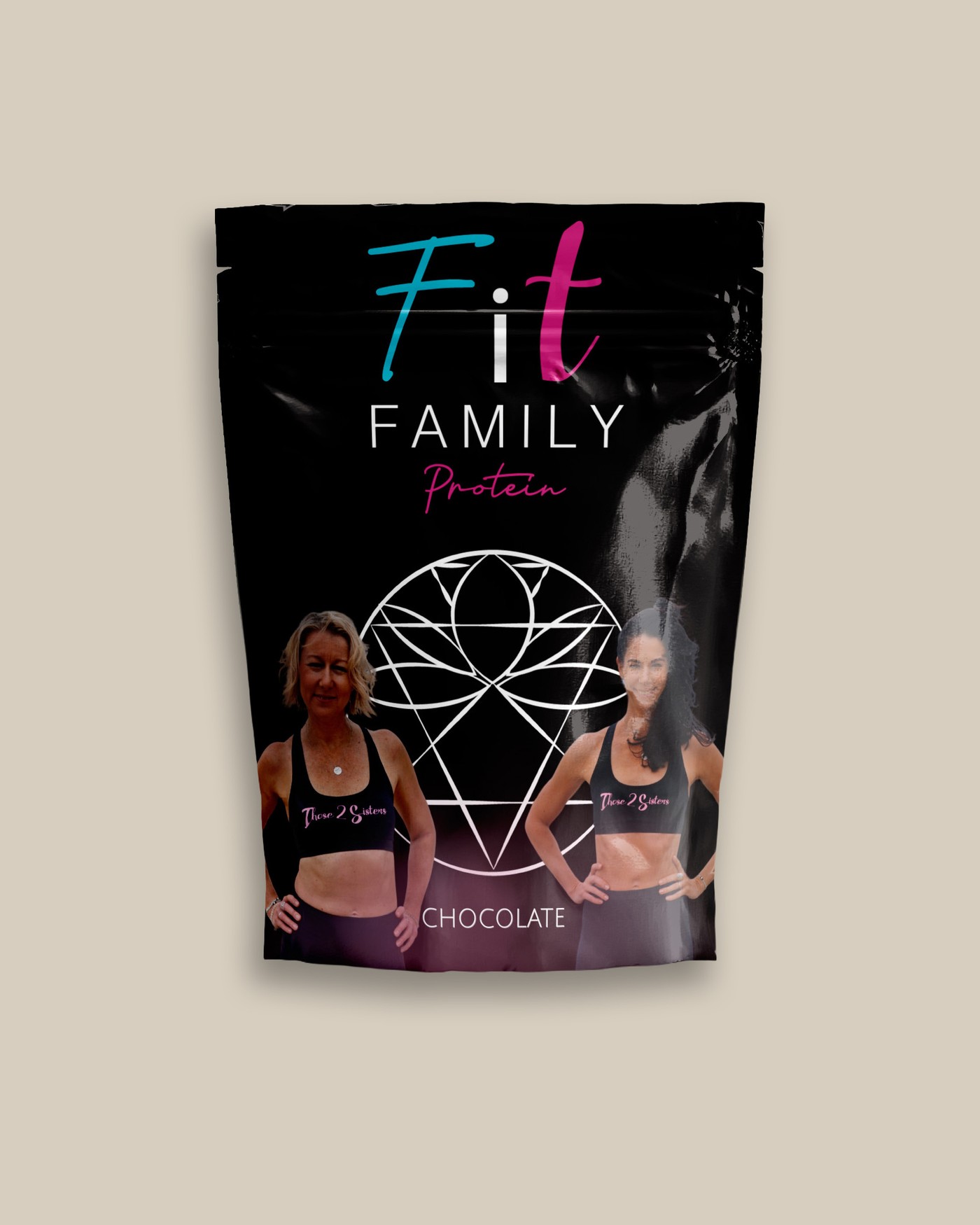
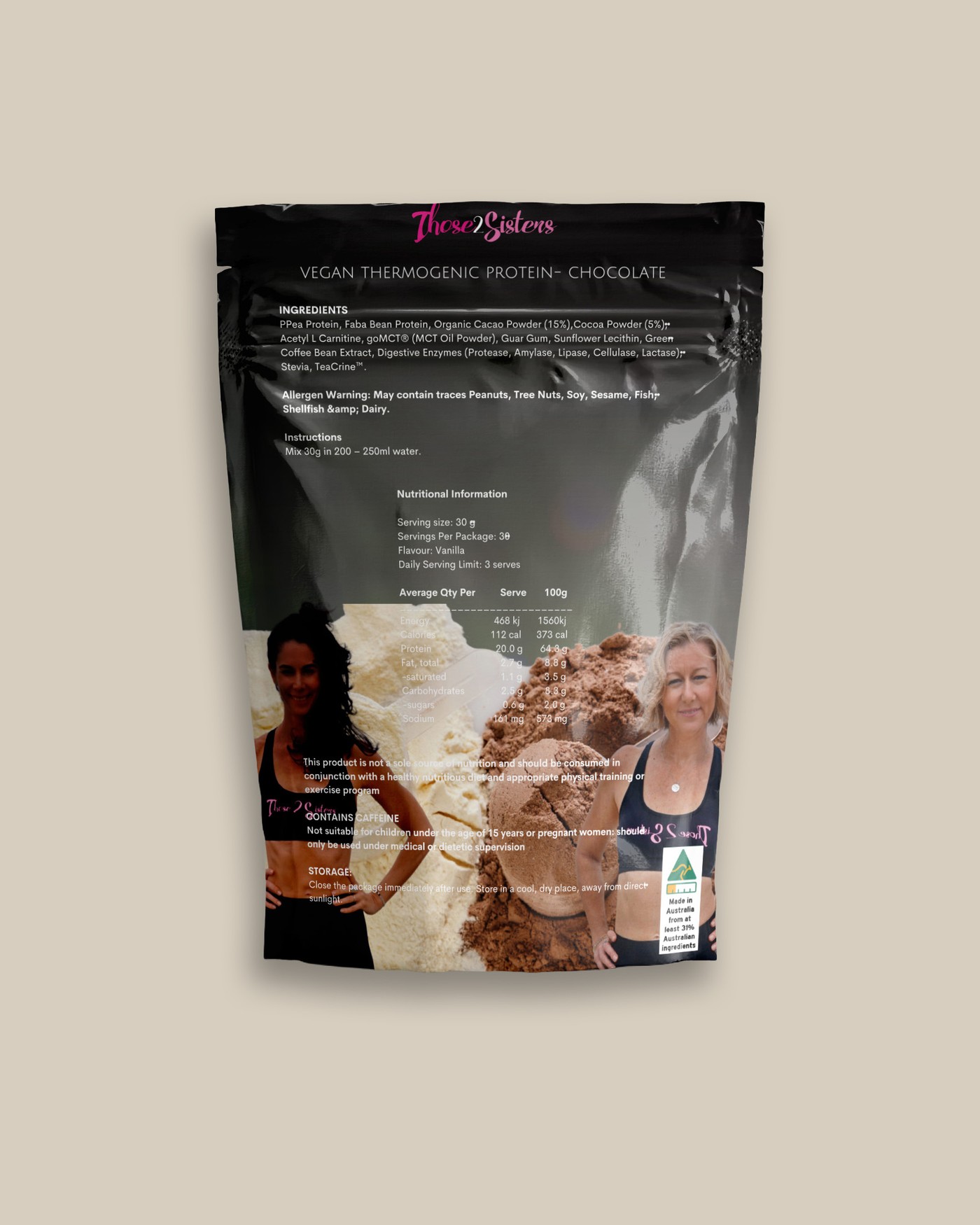
Fit Family Protein — Product Packaging
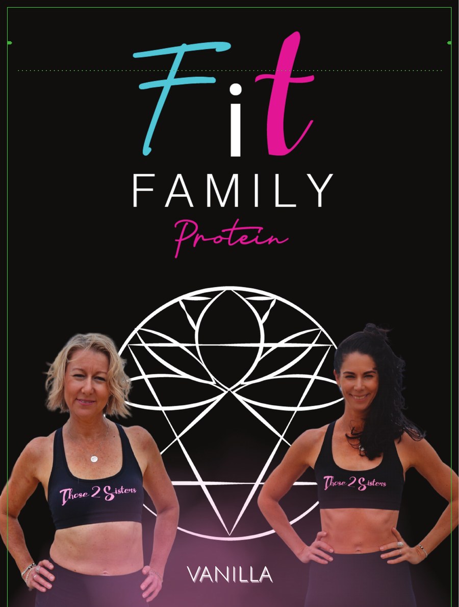
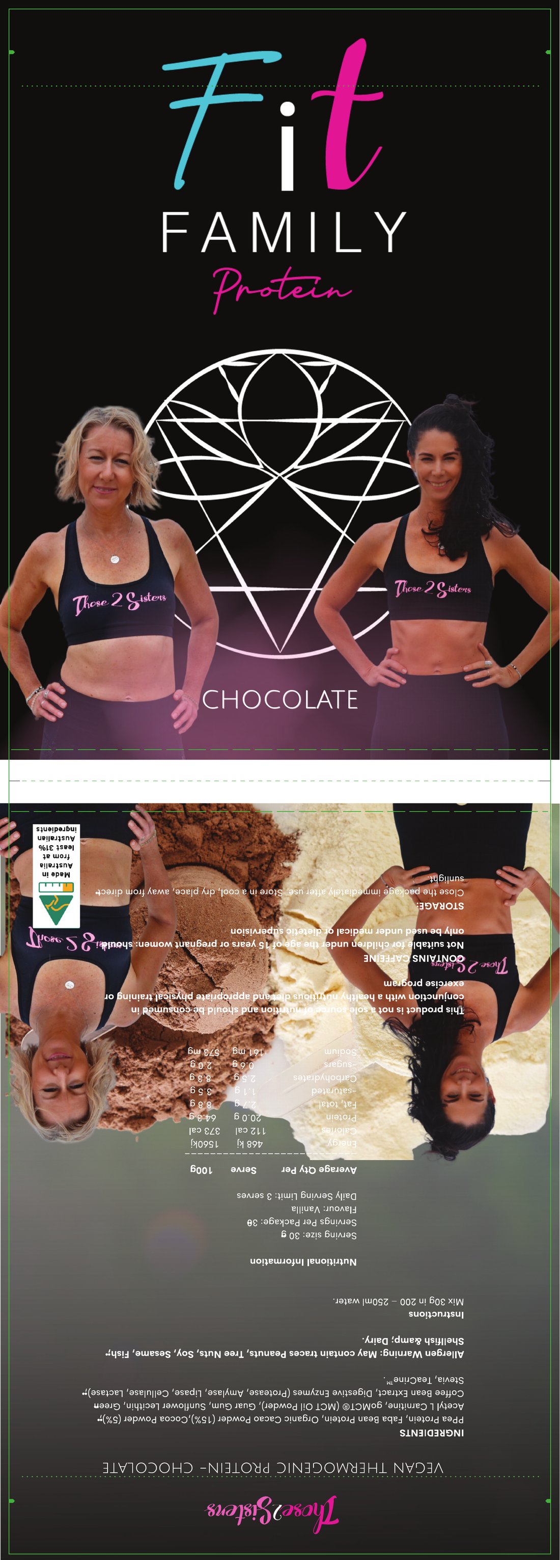
A two-flavor protein line packaged for retail — front-of-pack branding and a full regulatory back panel, built as a single print-ready pouch dieline.
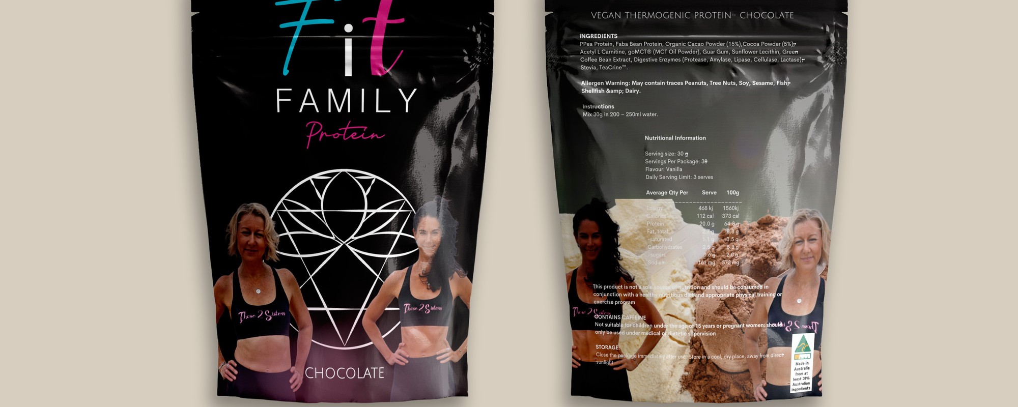
Front and back of the finished Chocolate pouch — the front carries the brand, the back carries a full regulatory panel, both from one press-ready dieline.