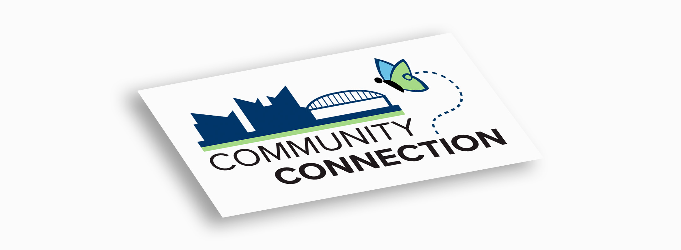
The final mark: a custom Chattanooga skyline tied to the parent brand's butterfly and color palette.
A program logo for Community Connection — designed to clearly belong to the Bethlehem Center, a United Methodist nonprofit in Chattanooga, while standing on its own with a custom city skyline. Brand-system thinking, from concept directions to final files.
Community Connection is a program under the Bethlehem Center, a United Methodist Centers nonprofit in Chattanooga, Tennessee. The challenge wasn't only to make a logo, but to make one that clearly belonged to the parent organization — echoing the Bethlehem Center's existing butterfly mark and brand colors while standing on its own as a distinct program identity.
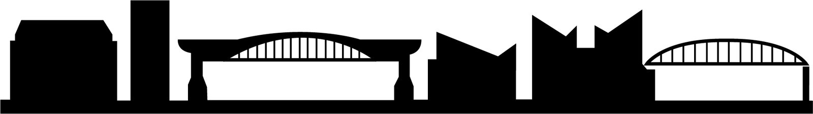
To root the program in the city it serves, I added a custom silhouette of the Chattanooga skyline. The result connects the people, the place, and the parent identity in a single mark.
The starting point was the Bethlehem Center's own logo: a butterfly formed from blue and green wings rising from an open book. The program logo needed to feel like part of that family, so I treated the butterfly and the blue-green palette as fixed brand elements to carry forward — the visual link that tells people Community Connection belongs to the Bethlehem Center.
The Bethlehem Center's butterfly-and-book logo, in blue and green. These were the non-negotiable elements: any program mark had to read as part of the same identity system.
I explored a few ways to tie the program to its parent. An early direction used linked human figures to express community. From there I introduced the parent brand's butterfly as a direct callout — then arrived at the strongest idea: pairing that butterfly with a city skyline, connecting the people, the place, and the parent identity in one mark.
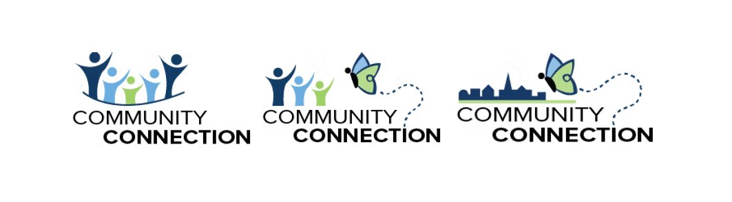
To ground the logo in Chattanooga, I built a custom silhouette of the city's recognizable skyline and bridge. I tested it across a couple of layouts, refining the proportions and how the type, skyline, and butterfly sat together, until the composition felt balanced and read clearly at a glance.
The final logo matched the parent brand's colors exactly, so it sits comfortably alongside Bethlehem Center materials while clearly marking the Community Connection program. It was delivered ready for print and digital use, including business cards and program collateral.
The mark in real use — at home next to the parent brand, distinct enough to carry the program on its own.
I design program and sub-brand identities that hold the parent's equity while earning their own — matched palettes, custom illustration, and print-ready delivery.
Start a project