
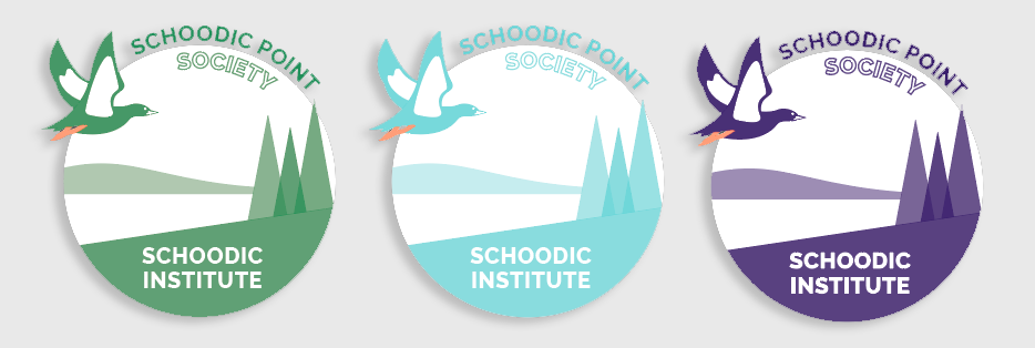
The final adopted mark, shown in its grey and conifer-green colorways.
A research-led, hand-drawn logo for the Schoodic Point Society — the planned-giving program of Schoodic Institute at Acadia National Park — built through deep client collaboration, from a pencil concept sketch to an adopted, printed vector mark.
Schoodic Institute — the research and education nonprofit inside Acadia National Park — needed a logo for a new planned-giving program, the Schoodic Point Society. The brief held a designer's classic tension: capture everything that makes this exact stretch of Maine coastline recognizable, and keep it simple enough to sit beside the organization's existing minimalist mark.
Before sketching anything, I asked one question: which bird is iconic to Schoodic Point? The client took it to their bird ecology director, who answered immediately — the Black Guillemot, a seabird with distinctive white wing patches and bright red legs. That single question decided the focal point of the mark, and just as importantly, it earned the organization's trust for every decision that followed.
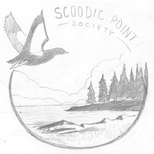
Every line in this mark started on paper. I want clients to see the work is genuinely originated by hand, so the progression below is the real arc — graphite concept, refinement, then a clean vector translation built for print and embroidery at any size.
A circular badge holding the guillemot in flight over a rocky shoreline, with conifers framing the scene — the three things that make Schoodic Point unmistakable. Working in pencil first let me solve composition, balance, and silhouette before committing to vector.
This sketch is the proof of process: fully hand-drawn, no AI, no traced stock art.
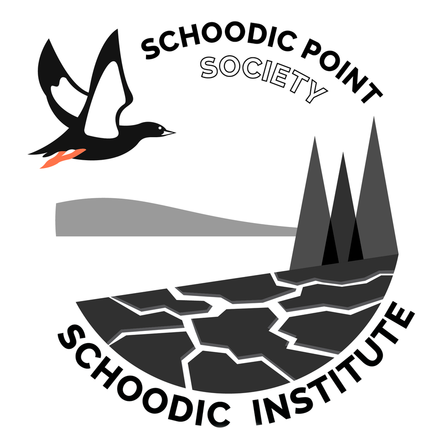
I rebuilt the sketch as true vector paths in Illustrator — not an auto-trace, but redrawn so the curves, weights, and negative space were intentional and scalable. The mark had to read at a gala banner size and on a lapel pin alike.
The result sits comfortably beside the Institute's existing minimalist identity without copying it.
I delivered the adopted mark in a coastal grey and a conifer green, plus single-color and reversed variants for flexible real-world use across print, web, and signage.
Final files were packaged print-ready: vector source, transparent PNGs, and a full colorway suite.
The Schoodic Point Society mark was adopted and put into use by the Institute. Beyond the deliverable, the engagement is a clear demonstration of how I work: research before sketching, real client collaboration through every round, and a hand-to-vector pipeline that proves the illustration is genuinely my own.
I design logos the way this one was made — research first, sketched by hand, delivered as clean, scalable vector files ready for any application.
Start a project