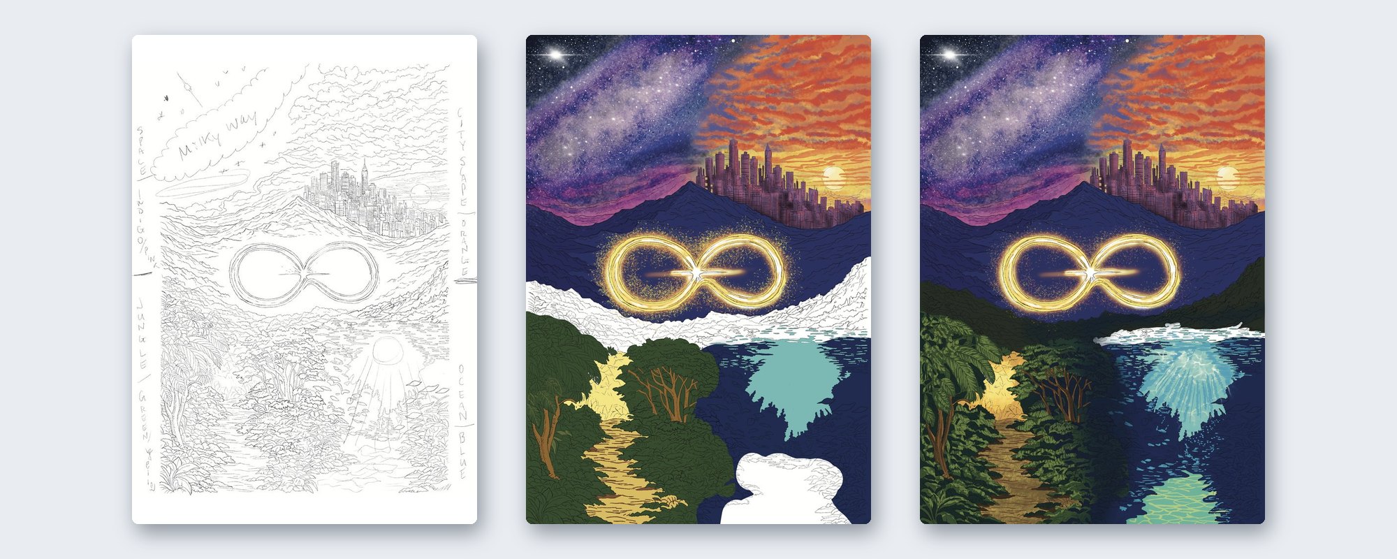
The Reincarnation cover in three stages: line art, flat color, final.
I started as an illustrator. Everything here was drawn by hand first. No AI.
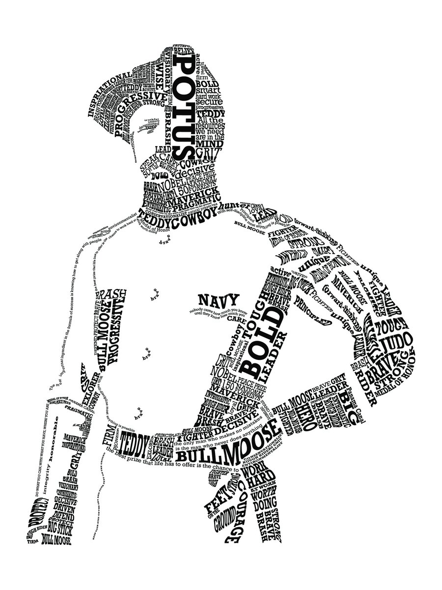
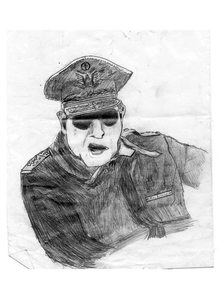
The subjects vary: graphite portraits, park landscapes, story characters, historical figures and lettering. Each piece starts as a drawing and is finished digitally, ready to print, frame or publish.
I take custom illustration work for gifts, books and businesses:
Planning a gift? Reach out early so there's time for a sketch round.
Three recent pieces that started on paper and ended as a published book, a printed poster and a framed object.
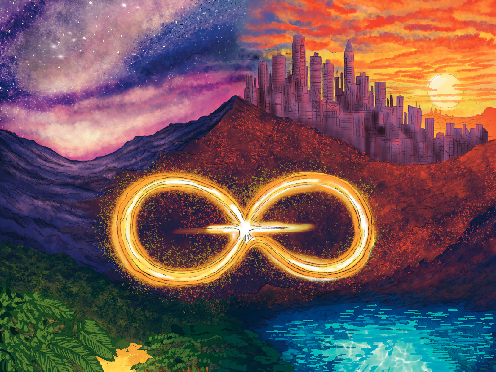
A hand-drawn wraparound cover for a published novelette: four worlds tied together by a gold infinity symbol.
View case study →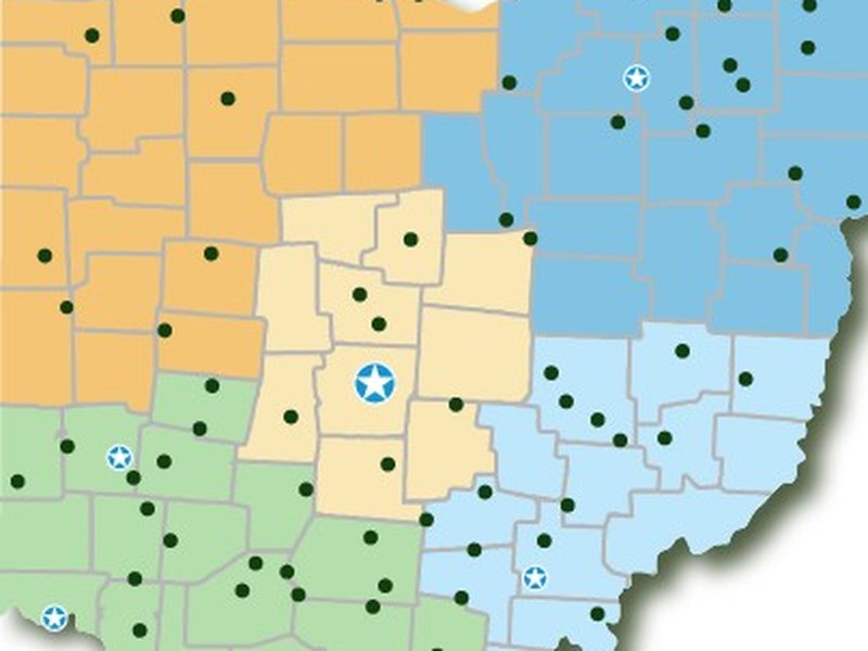
All 75 parks drawn county by county as a print poster, then rebuilt as an interactive map.
View case study →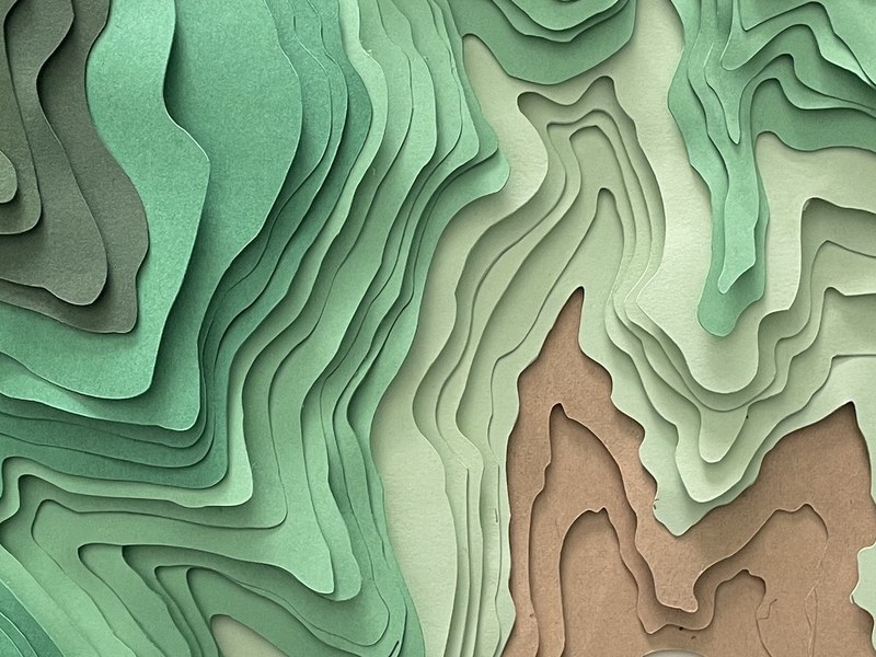
A topographic map drawn in Procreate, cut into paper layers and assembled into a framed shadowbox.
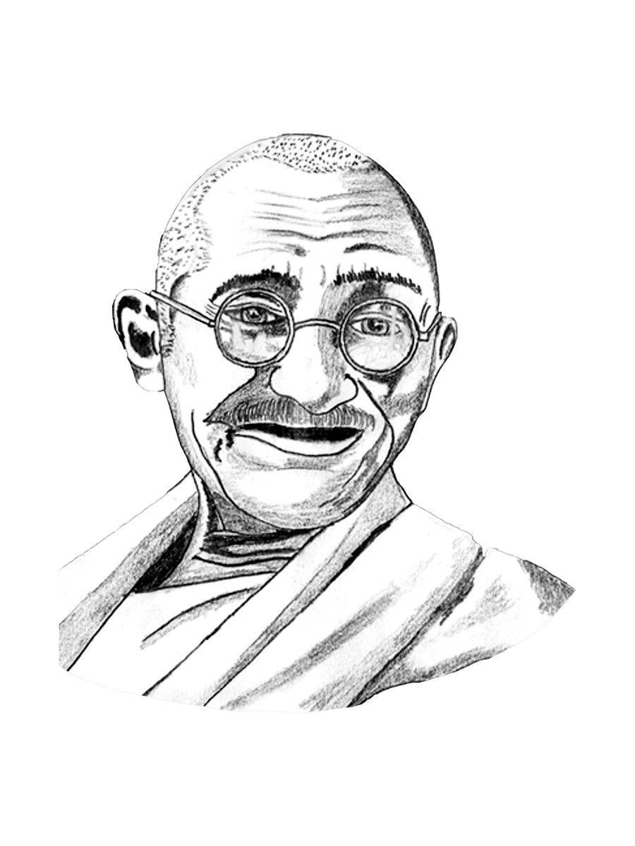
View case study →Graphite portraits focused on likeness, light and the texture of skin, hair and cloth.
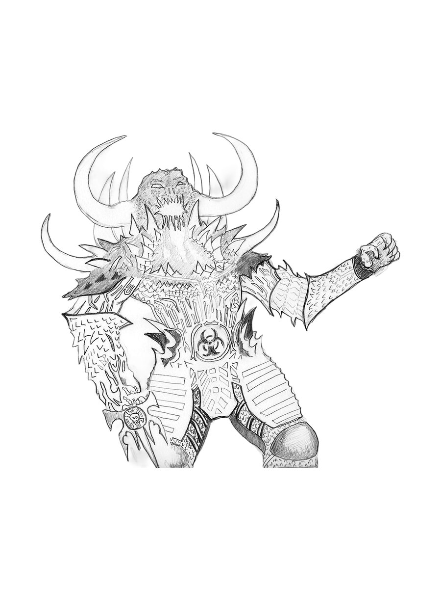
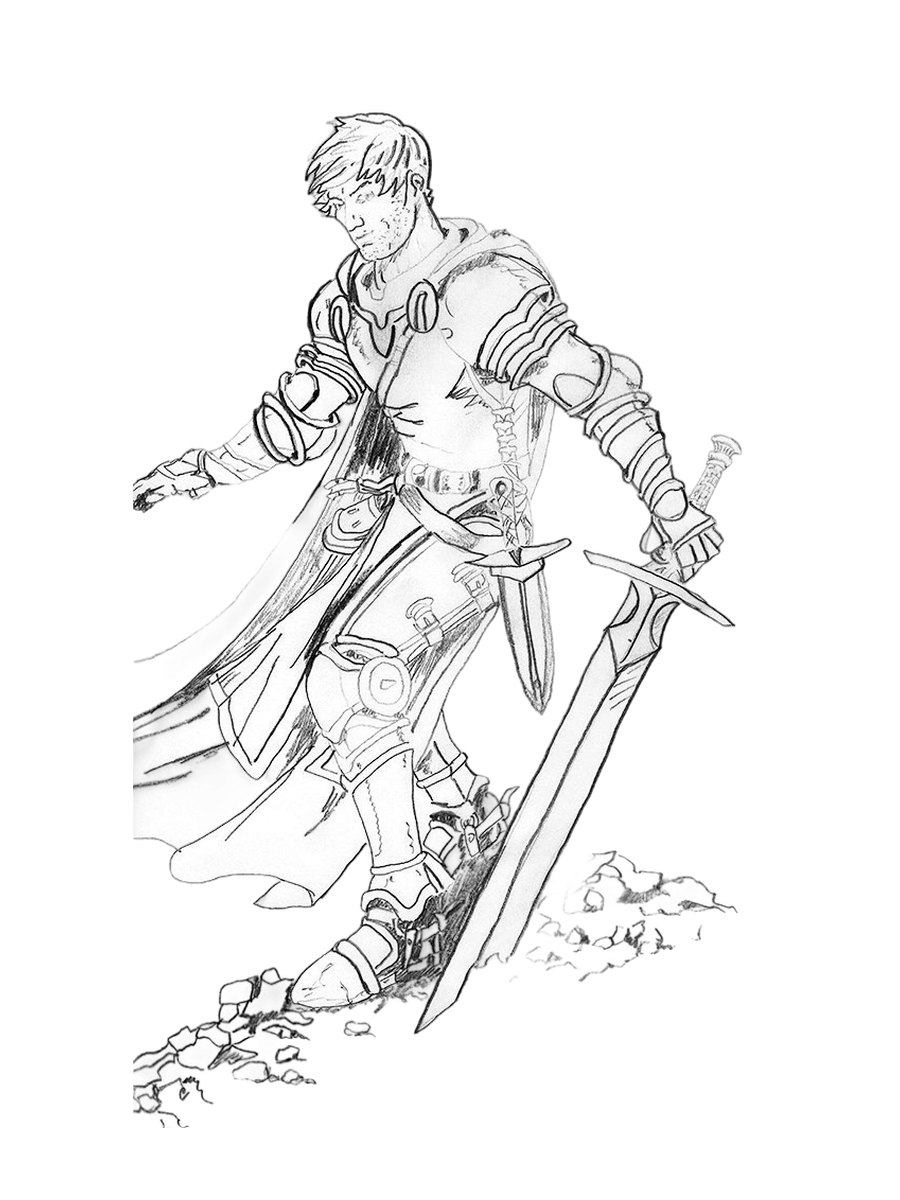
Tone is built up in layers of graphite, from light hatching to dense darks, to get the weight of the hair, the scars and the texture of the armor.
Drawn by hand, no tracing and no AI.
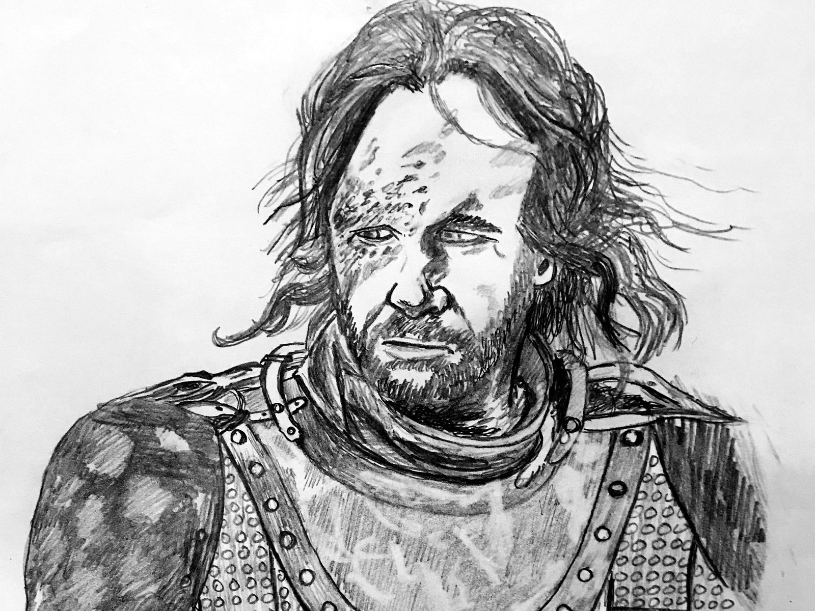
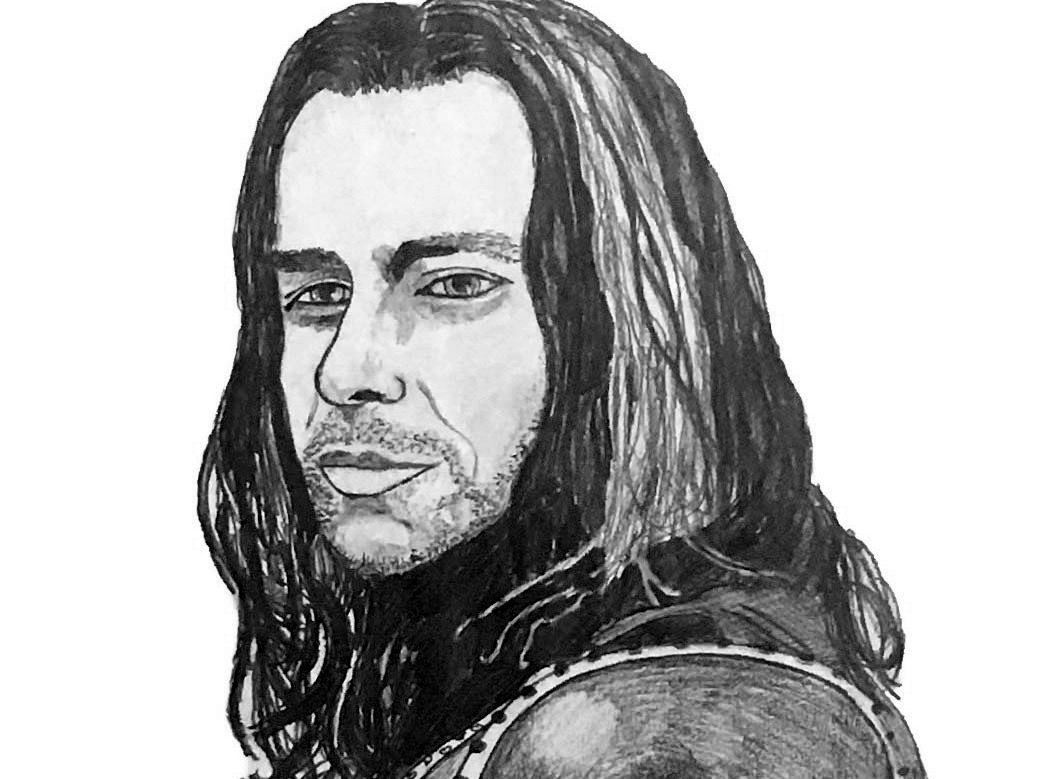


Every finished piece starts as graphite on paper. This portrait went from a grid transfer to a rendered pencil drawing to the cleaned-up final.


I finished the line work on paper, scanned it and colored it digitally.


I studied history before design, and it still shapes what I like to draw: historical figures, journeys and documents, made to teach something as well as look good.
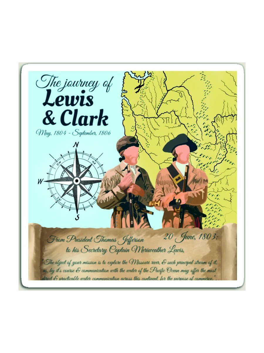
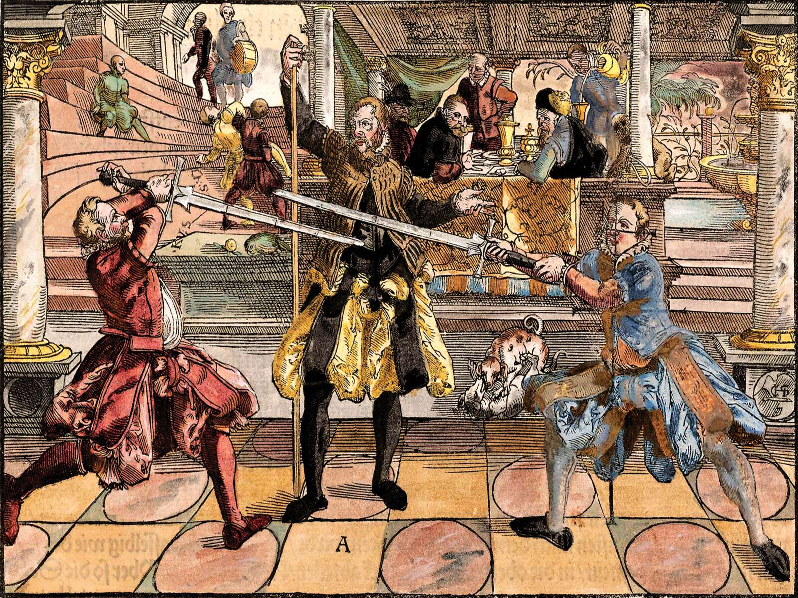
For a client, I hand-colored a 1570 fencing woodcut by Joachim Meyer, keeping to period colors and building the file so a UV printer could lay it down cleanly over the original line work.
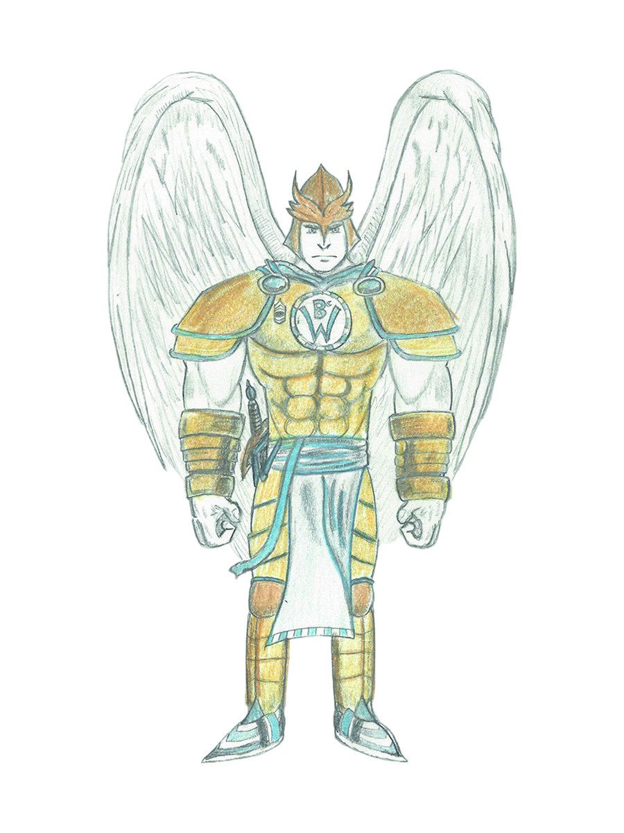
Character sketches worked out in pencil first: silhouette, armor, pose and personality, then taken into color when the design is settled.


An ongoing series of national parks, the same subject as my CreativePalmer print work. I reduce each park to its most recognizable forms and a limited palette.
A piece from the series in a bold, poster-style treatment.


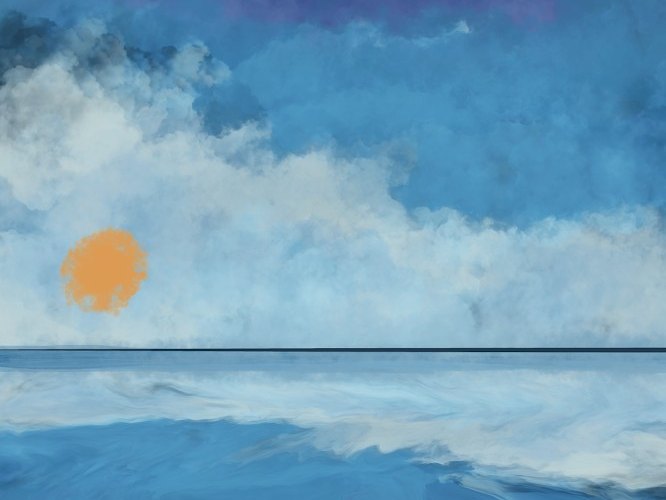
Softer digital paintings of landscapes, focused on mood and light.


These are from the 20+ commercial illustrations I drew for Roman Atwood's Smile More brand. The lettering stays consistent while the surface treatment changes.


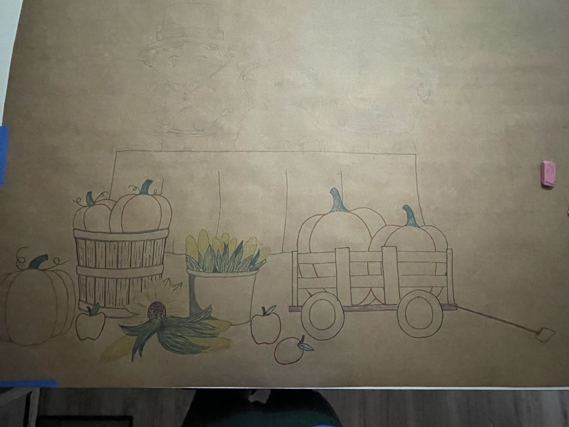
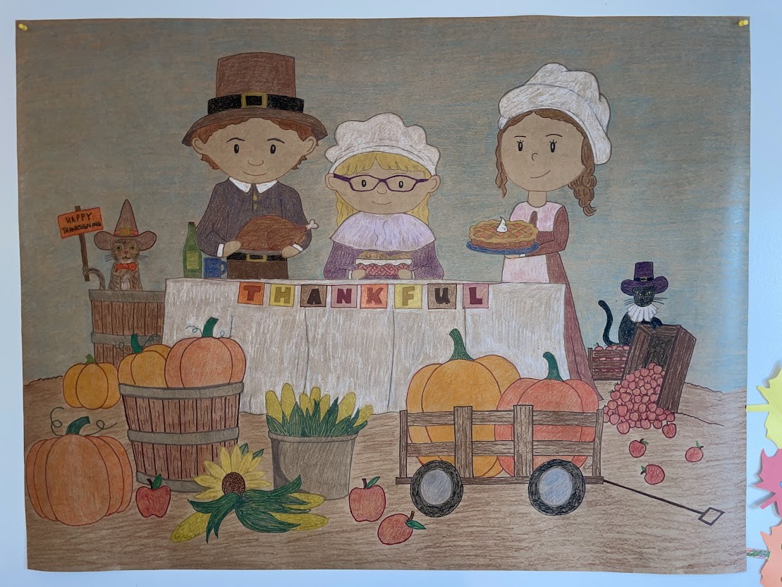
Some pieces are big: a 5×8 ft colored-pencil banner hangs in our living room. I also hand-painted an anniversary banner.
I drew and colored it by hand in colored pencil: a family of three as pilgrims at a harvest table, with pumpkins, produce and two costumed cats.
I built it in sections and kept proportion and palette consistent so it reads as one piece from across the room.

I painted a sunset lake scene with two figures fishing from a boat, brushed “Cheers” lettering and a leafy border.

I draw likenesses, places and characters on paper and finish them as clean digital files. No stock, no tracing and no AI.
I draw portraits, places and characters by hand and finish them digitally for print or screen.
Start a project