Case Study · Brand Identity · SNHU Capstone

Designing my own brand, end to end

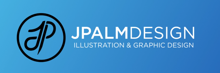
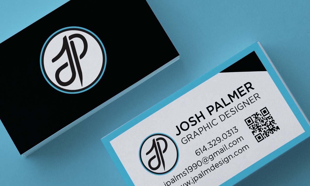
A complete personal brand identity suite — logo system, palette, type pairing, business card, letterhead, and resume — built as my final capstone at Southern New Hampshire University.

JpalmDesign brand identity suite — resume, business cards, and case insert shown together on a blue background, unified by the JP monogram and cyan-and-black palette

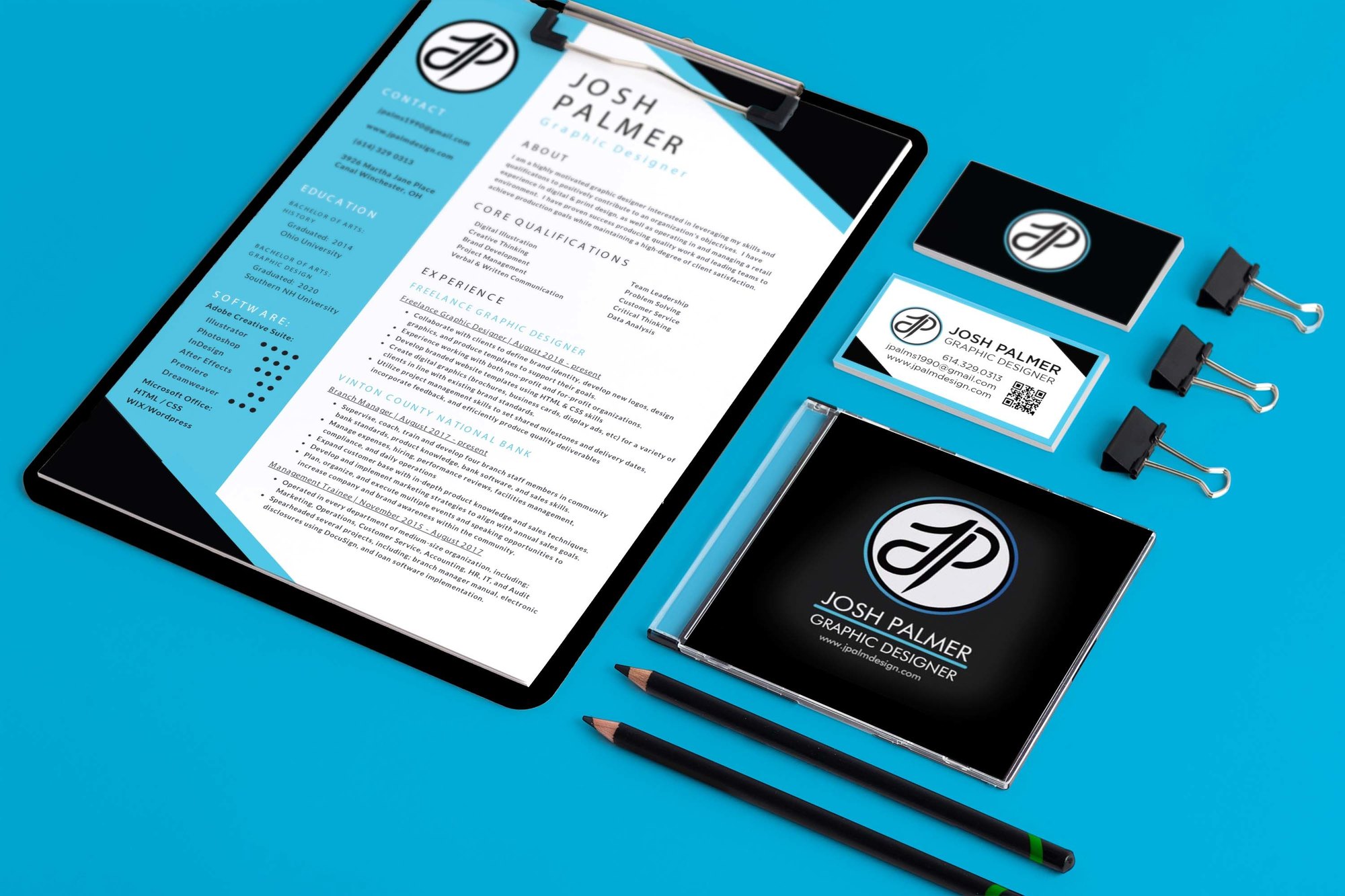
The full suite, shot as one system — every piece carries the same monogram, palette, and type discipline.

Role
Self-directed brand designer & art director
Context
SNHU Graphic Design capstone
Deliverables
Logo, palette, type, card, letterhead, resume
Published
November 2021

Designing for yourself is the hardest brief — there's no client to define the constraints, so you have to set them. For my capstone I built a complete designer-focused brand from the ground up, with one rule: every piece had to read as part of the same identity.

The system is anchored by a custom JP monogram that interlocks the two letters into a single calligraphic mark, set inside a ringed badge. From there I built outward — a cyan-and-black palette, a type pairing, and a full set of touchpoints — keeping color application and typographic rules consistent so the resume, the card, and the letterhead all clearly belong together.

One monogram, built to flex

The JP monogram had to work as the keystone of the whole system — legible on a large letterhead and still sharp shrunk onto the back of a business card. Interlocking the J and P into one continuous stroke gave the mark a personal, hand-built quality while the surrounding ring kept it disciplined and badge-like.

The JP monogram — interlocked J and P in a ringed badge, cyan outer ring on black
The primary mark.
JPALMDESIGN horizontal wordmark lockup with the JP monogram and the tagline Illustration and Graphic Design
The horizontal lockup with wordmark and tagline.

From sketch to vector to motion

A static mark is the deliverable; making it move is the bonus. To push the capstone past the brief, I took the same JP monogram I'd built as clean vector and animated it — the letters drawing on and resolving into the full signature, then settling into the badge. It's a short, loopable studio bumper built entirely from the vector artwork, so it stays razor-sharp at any size.

The monogram animated — vector logo to motion, the same identity in a five-second loop. See more motion work →

Consistency across every touchpoint

The test of an identity isn't the logo — it's whether the rest of the system holds together once the logo leaves the page. The business card pairs a bold monogram face with a clean information back; the same palette, type, and spacing logic carry across the resume and letterhead so the whole suite reads as one voice.

JpalmDesign business cards — a black monogram face and a white contact back with QR code, shown stacked on a blue surface
Business card, front and back — the monogram as the brand's handshake.
Brand Identity
Full system, mark to touchpoints
Typography & Art Direction
Type pairing and consistent rules
Logo & Print Design
Monogram, card, letterhead, resume

Note: this was the foundation brand I built in 2021. The live identity for this site evolves the same monogram into a navy-and-gold palette — proof that a well-built mark can be carried forward and re-skinned without losing what makes it recognizable.

Need a brand built from the ground up?

A mark, a system, and every touchpoint that has to carry it — designed to stay consistent everywhere it lands.

Start a project →
← Back to Visual Design work