Case Study · Packaging & Print Production

7-Inch Vinyl Jacket & Record Labels

A retirement ceremony program built as a real printed vinyl record — jacket and two die-cut labels, adapted to a manufacturer's dieline under a strict no-redesign mandate.

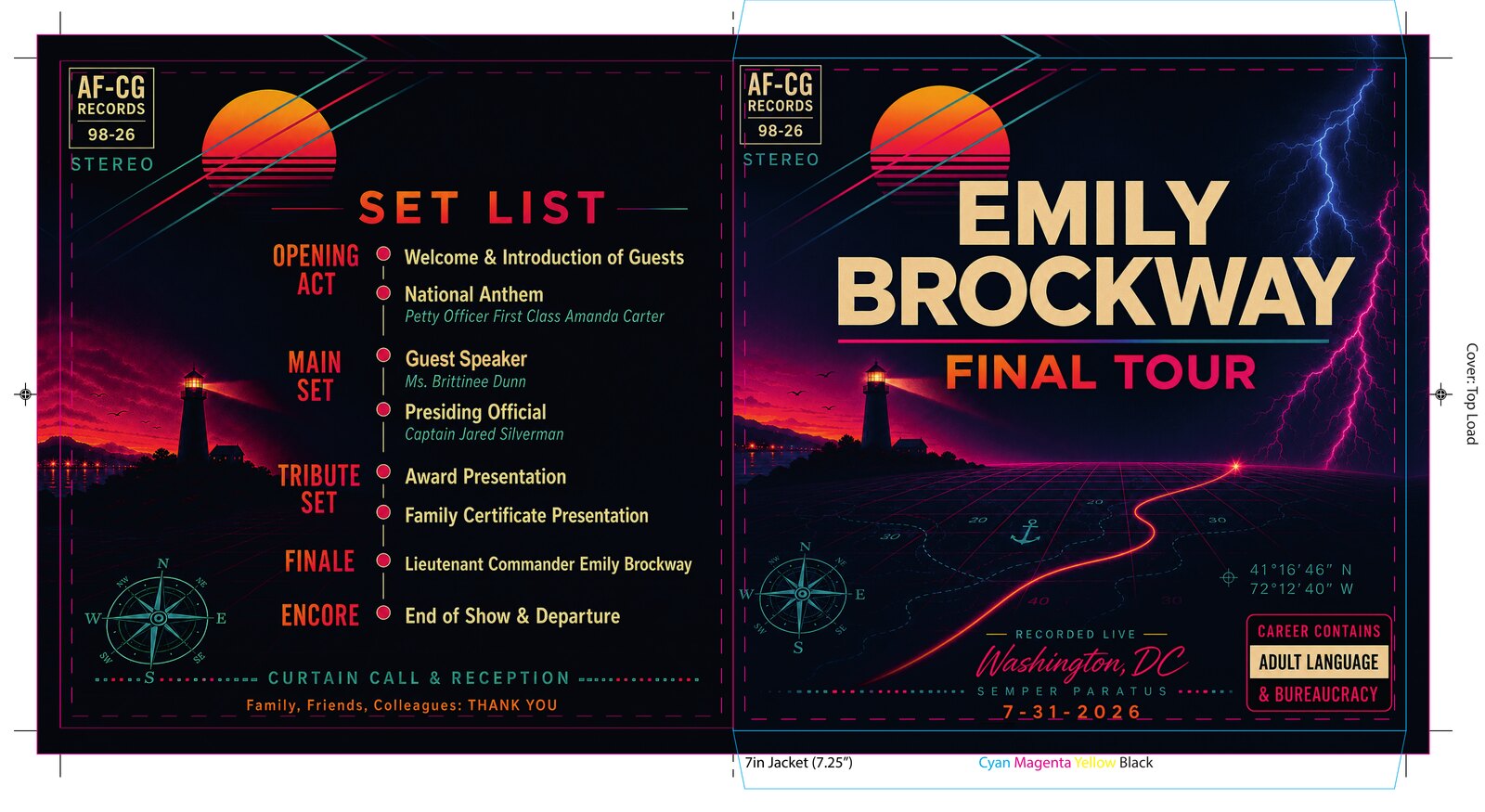
The finished 7-inch vinyl jacket, front and back — a synthwave lighthouse scene with the title treatment on the front and a program set list on the back

Front and back of the finished jacket. The ceremony program is structured as an album set list; the honoree's career is the track listing.

Client
Emily Brockway
My Role
Production layout & print preparation
Scope
7.25" jacket + two 4" circular labels
Tools
Illustrator · Photoshop · Acrobat Pro

A retiring officer wanted her ceremony program to be something other than a folded sheet of paper. So the program became a record: a printed 7-inch vinyl jacket, with her Air Force and Coast Guard assignments pressed onto the labels as track listings.

The concept and artwork were already designed and approved. My job was the part that decides whether a good idea survives contact with a manufacturer — adapting approved art to the supplied dieline, resolving every bleed, fold, and safe-area requirement, and delivering files that print correctly the first time against a hard ceremony date.

Scope note, stated plainly: the source artwork was supplied by the client and was generated with AI before I was engaged. My engagement was explicitly production layout, print preparation, and template adaptation — not creative redesign. The illustration work elsewhere in this portfolio is drawn by hand; this project is a prepress case study, and it's presented as one.

Change everything about the file, nothing about the design

The brief was unusually strict, and correctly so. The client had chosen her typography, colors, wording, and composition deliberately. The instruction was: do not rewrite text, do not substitute fonts, do not replace graphics, do not change colors, do not redesign the composition.

What was permitted is exactly the vocabulary of production work — proportional scaling, extending background into bleed, cropping non-critical background, optical centering, alignment and kerning refinement, repositioning to hold safe margins, and reconstructing background artwork beyond the trim where the original simply didn't extend far enough.

That gap is the whole job. Artwork designed without a dieline in mind almost never reaches the bleed edge, and its critical elements almost never sit where the safe area wants them. Closing that gap without the client being able to see that anything moved is the craft.

“The finished files should appear as though they were originally designed specifically for the manufacturer's templates.”

— from the client's statement of work

Built to the manufacturer's dieline

The jacket is a side-load 7.25-inch sleeve printed on 15pt board. Front and back live on one flat spread that gets folded and glued into a pocket, which means the file has to carry the dieline, the bleed limit, the fold, the glue flap, and the load orientation all at once — and the artwork has to survive every one of them.

The full jacket spread shown over the manufacturer's template, with the dieline, bleed limit, safe area, side-load and top-load orientation labels and CMYK color bar visible
The spread on the supplied template. Teal is the dieline, magenta is the bleed limit, and the dashed inner rectangle is the safe area. Background art was reconstructed past every trim edge so nothing unprinted appears after cutting and folding.
Front cover of the vinyl jacket — title treatment over a synthwave lighthouse and grid horizon, with coordinates and a parental-advisory style panel
Front cover. The title stack holds the optical centre while the lightning and horizon carry to bleed on three sides.
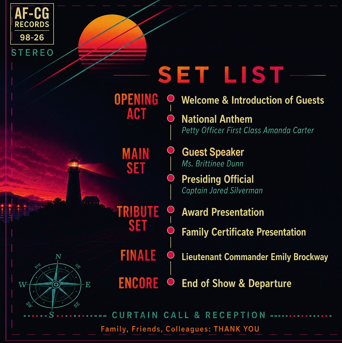
Back cover of the vinyl jacket — the ceremony program laid out as an album set list with opening act through encore
Back cover. The program timeline keeps its original alignment and spacing; only the margins around it moved.

The markup that prevents the reprint

Before anything went to the manufacturer I marked my own file and sent it back to the client as an annotated proof. Every circle is a decision that needed a human answer rather than a designer's assumption — and on a job with a fixed ceremony date and no time for a second print run, the annotated proof is the cheapest insurance available.

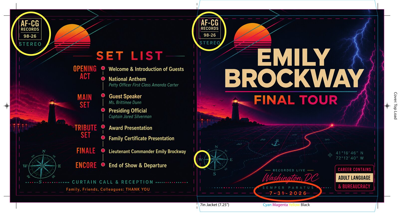
The annotated production proof of the jacket spread, with yellow circles marking the record-label logo blocks and compass rose and an orange circle marking the date line for client confirmation
The annotated proof. Yellow marks elements needing a size or position decision — the two logo blocks and the compass rose. Orange marks the date line, the one element where a typo would be unrecoverable after printing.

Why mark your own work: a client who is new to print — as this one described herself — cannot be expected to know which questions matter. Handing over a clean proof invites “looks great,” and “looks great” is how errors reach the press. Handing over a marked proof turns a vague approval into a set of specific, answerable questions.

Two labels, one spindle hole

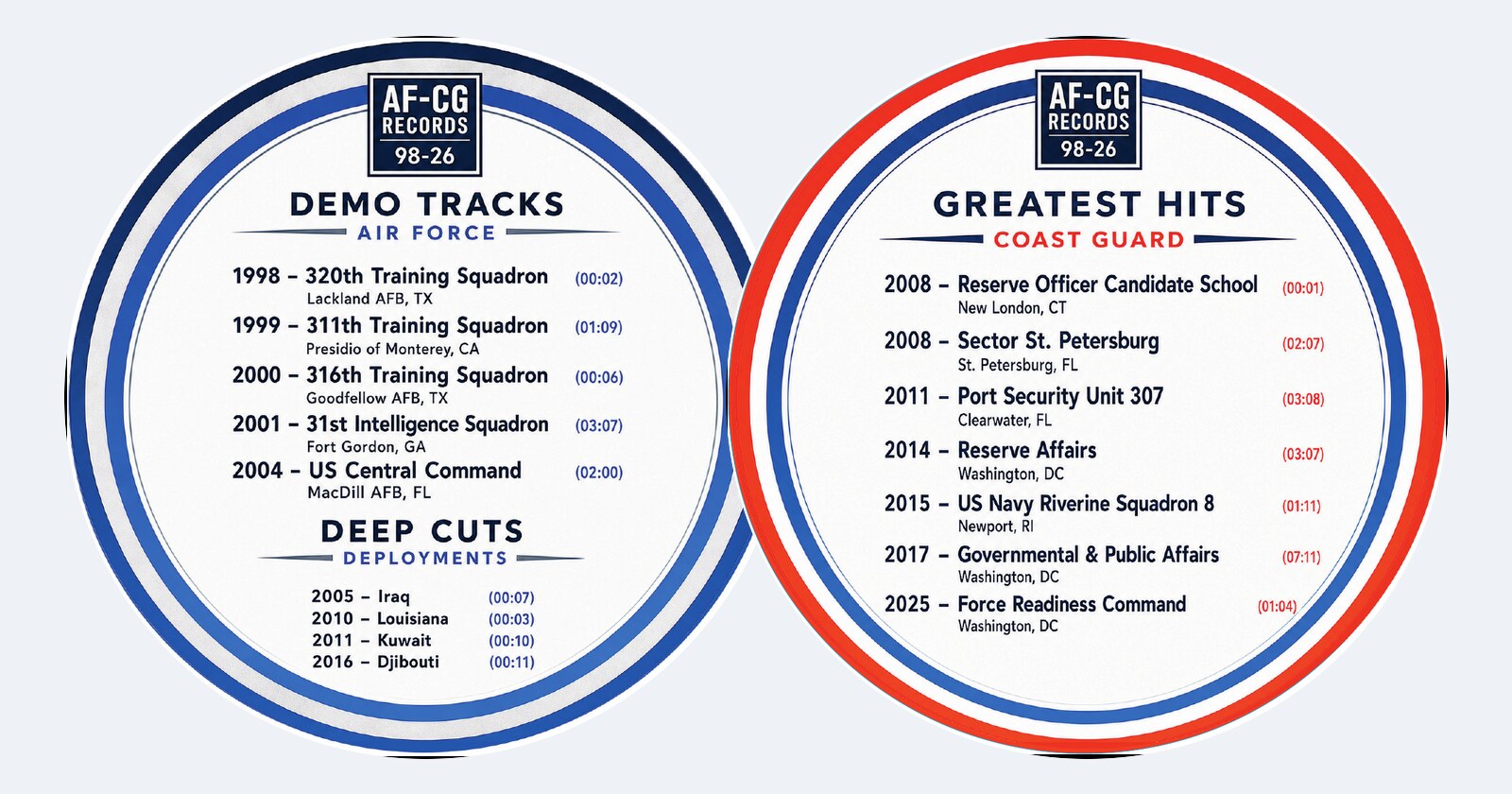
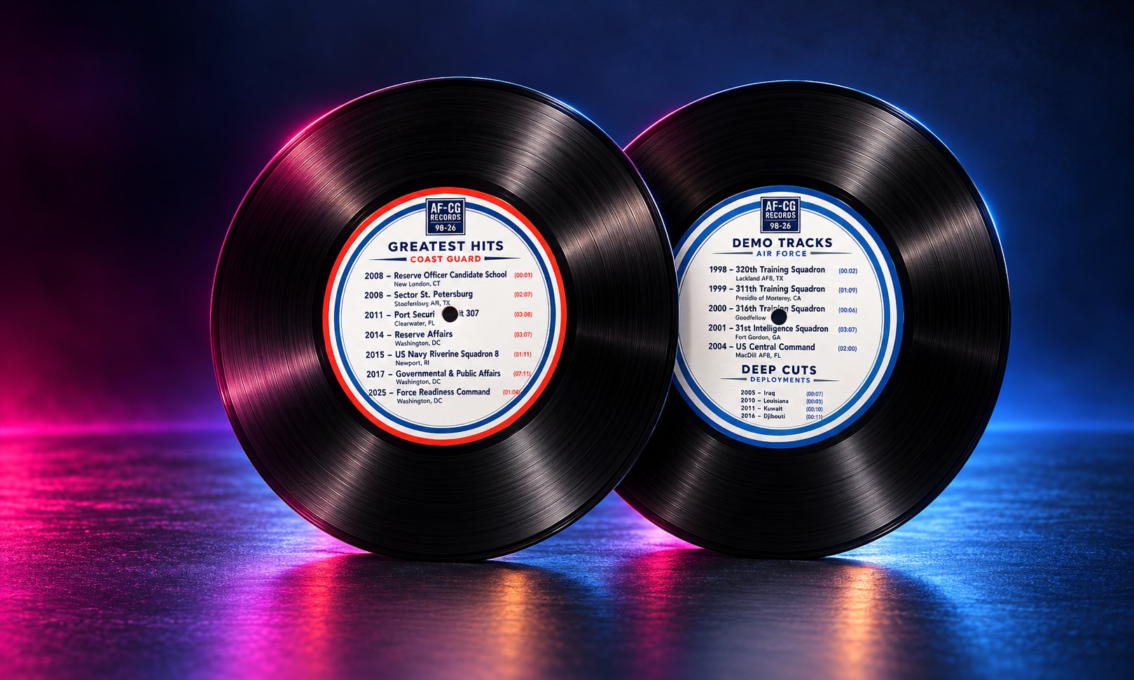
The two 4-inch circular labels carry the two halves of a career — Air Force as the demo tracks, Coast Guard as the greatest hits, each assignment a track with a duration standing in for time in service. They share a structure and diverge only in palette, so the pair reads as an A-side and a B-side rather than two unrelated stickers.

Circular labels have their own failure modes: type has to clear the spindle hole at the centre, spacing around the outer ring has to stay even, and nothing can clip at the outer trim once the die lands with its normal tolerance. Optical centring matters more than geometric centring here, because the ring of colour is what the eye actually reads as centred.

The two circular record labels side by side — Air Force demo tracks in blue and Coast Guard greatest hits in orange and blue, each listing assignments as tracks with durations
Air Force and Coast Guard labels. Identical structure, mirrored palettes, all type clear of the spindle-hole safe zone and inset from the outer trim.
7.25 in
Side-load jacket, 15pt board, CMYK
4 in
Two circular labels, die-cut, spindle-hole clearance held
Packaged
Layered sources, press PDFs, hi-res exports, fonts and links

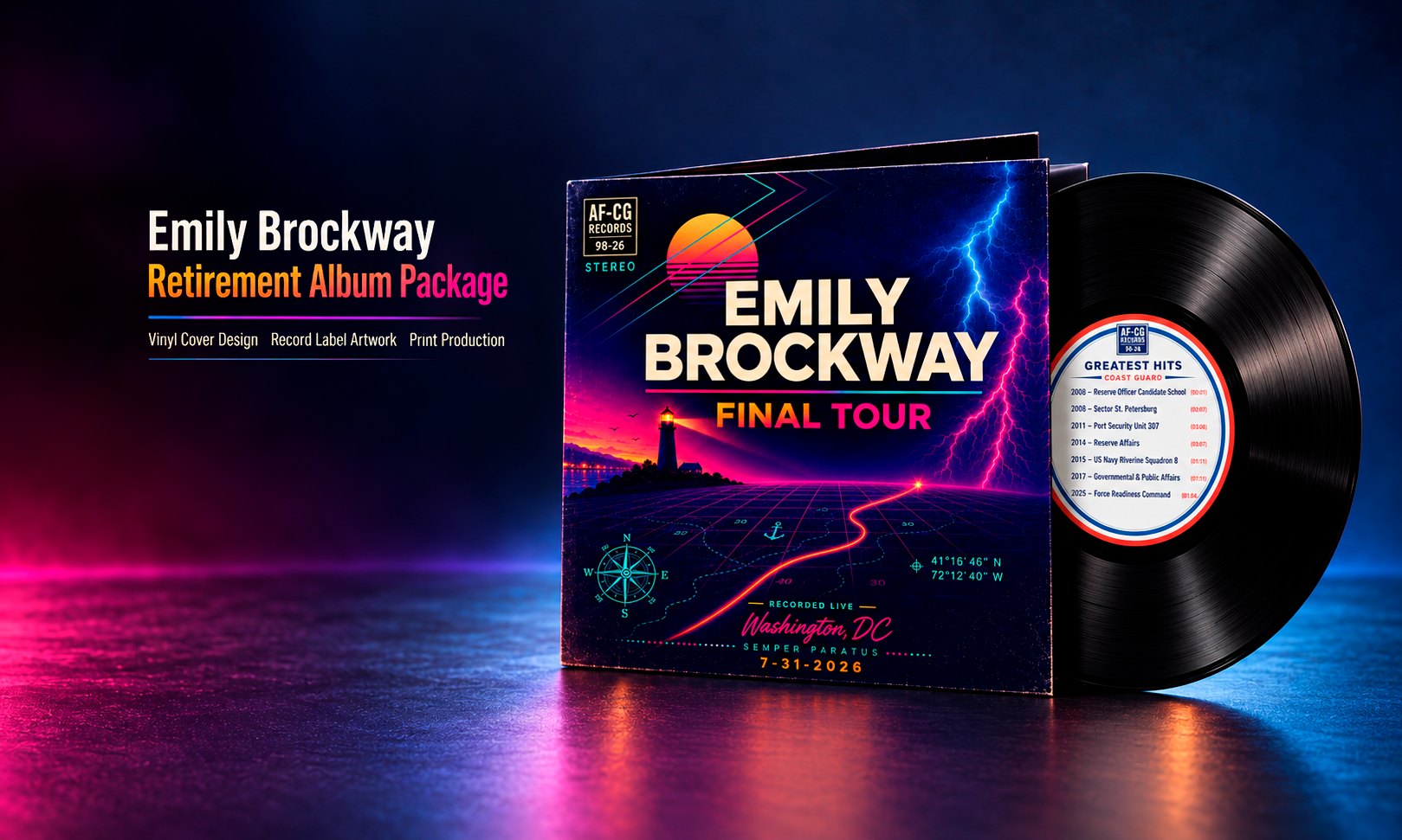
The package, presented

The jacket and labels shown as the finished retirement album package.

Presentation mockup of the Emily Brockway Final Tour vinyl jacket with a record partly out of the sleeve
Jacket and record, presented together.
Presentation mockup of the two record labels — Coast Guard greatest hits and Air Force demo tracks — on vinyl discs
The two labels, presented on vinyl.

Delivered ahead of a fixed date

First draft inside twelve hours of award, final package ahead of the deadline, and a physical program that the honoree's family and colleagues kept. The delivery included layered source files, print-ready PDFs, high-resolution raster exports, and packaged fonts and linked assets, so the manufacturer had everything without a follow-up request.

“Absolutely top-notch work from Josh. I appreciated his patience and thorough questions to ensure he gained the right information from me — a complete novice in the world of design.”

— Emily Brockway · 5.0 ★ Upwork engagement

Why this matters for hire: most print jobs arrive as approved artwork that was never built for a press. The value isn't in redesigning it — it's in getting it onto the dieline so faithfully that nobody can tell it wasn't designed there in the first place, and in asking the three questions that keep the job off a second print run.

Have artwork that needs to become a printed object?

Dieline adaptation, bleed and safe-area work, and press-ready packaging — with the questions asked before the file ships, not after.

Start a project →
← Back to all work