Project · Brand Identity & Print
Prater Landscaping — Full Brand Identity
A new landscaping business, branded from the logo out to every print piece a crew leaves behind.
A new landscaping business, branded from the logo out to every print piece a crew leaves behind.
Prater Landscaping was a brand-new business that needed an identity capable of showing up everywhere a landscaping company does — a truck door, a lawn sign, a business card handed across a fence, a brochure left in a mailbox.
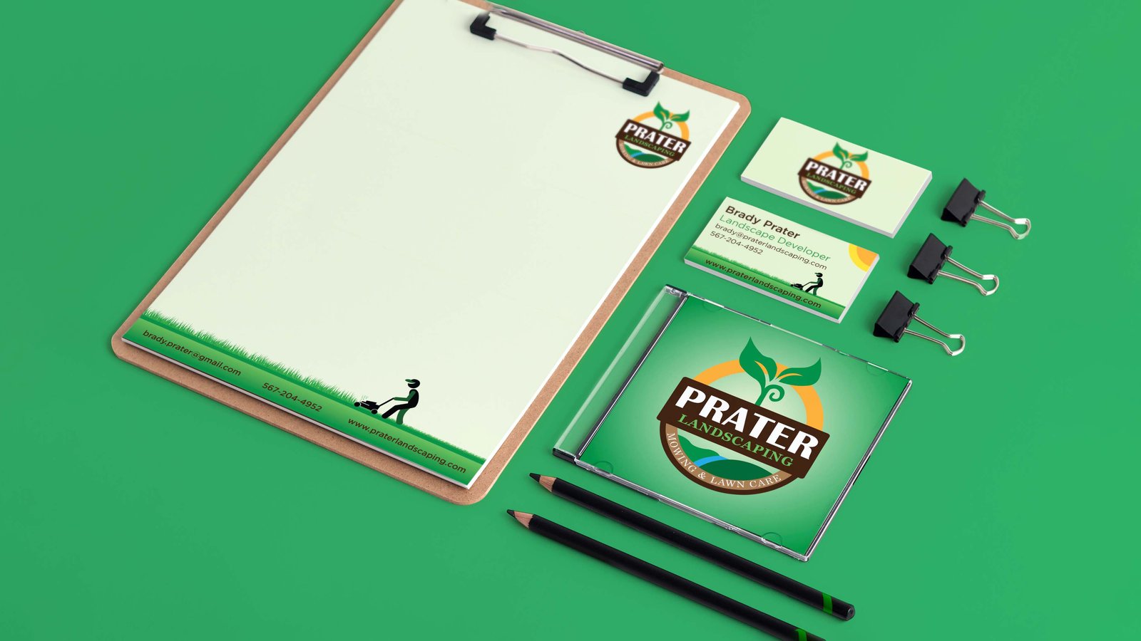
I built the whole system from the ground up: a logo developed to read clearly at a distance and at thumbnail size, a green-and-earth color palette drawn from the work itself, and a full set of production-ready print deliverables. The goal was a brand that looked established on day one.
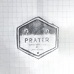
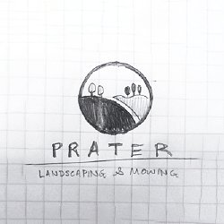
The logo started on paper. I explored three badge directions by hand — a hexagon, a circle, and a shield — before identifying the elements worth carrying forward: a cross-section of ground with a plant rising through it, and the name in a strong banner.
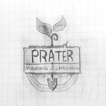
From the selected sketch I built three digitized versions, refining the plant, the ground cross-section, and the color palette across rounds. The final version added a warm orange sun arc — a third color that contrasts the cool green plant and gives the mark a strong compositional anchor.
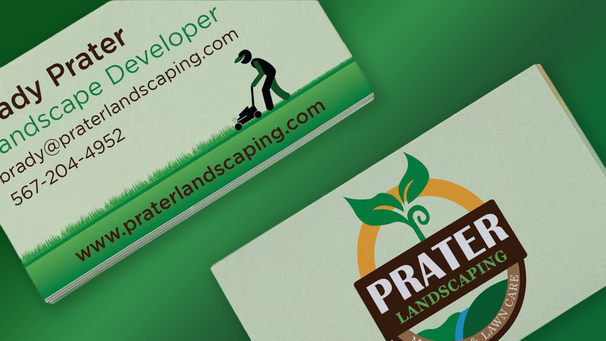
The logo centers a growing sprout rising through a gold ring — growth and care — anchored by a strong wordmark in a brown banner so the name stays legible even when the mark is shrunk onto a card or stretched onto a vehicle. A landscape vignette along the bottom ties it to the actual service.
The centerpiece print piece was a six-panel tri-fold brochure. I designed both sides as a single coordinated system — an outside that works as a standalone handout and an inside spread that lays out services, so the piece does its job whether it's glanced at or read.
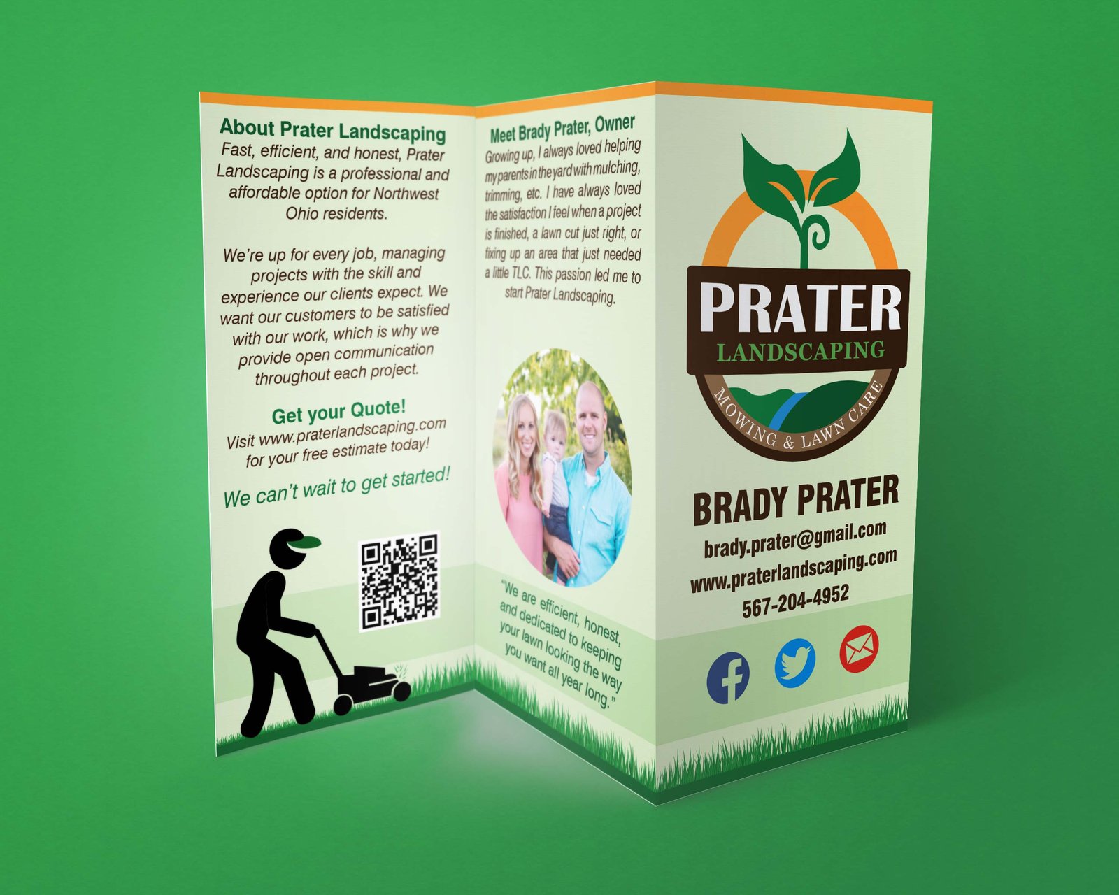
Every deliverable was prepared as a press-ready file — correct color mode, bleed, and trim for its format. The tri-fold was set up with proper panel widths so the folds land where they should; the business cards were built with bleed and safe margins; the logo was delivered as scalable vector art so it holds up from a card to a yard sign.
Beyond the pieces shown here, the system extended to letterhead, yard signs, and vehicle magnets — the full kit a new landscaping business needs to look consistent across every touchpoint.
"Josh Palmer is very talented, and excellent to do business with. Josh came up with unique and exceptional logo designs for my landscaping business, was great to communicate with, and helped me every step of the way. From ordering business cards, yard signs and vehicle magnets, to paper or digital ads, Josh handled it all for me and had everything shipped right to my company."
— Brady Prater, Owner, Prater Landscaping
I build complete identities — logo, color, type, and every print piece prepared to land clean on press.
Start a project →