My first year owning the platform, before moving into attributes, tags & SEO
What I did
Audited the editor end to end, reproduced the bugs, and worked with the developer to ship fixes
The one thing to know
A customer could set a color, watch the tool show one thing, and get a different color in print. I found why, proved it, and got it fixed.
Context
Splotchy Signs let anyone design a custom sign or banner in the browser and order it for print. The whole promise of the product was what you design is what you get. When that breaks on a tool people are paying to use, every other feature stops mattering.
I owned the platform. The design editor was a customizer plugin layered on top of WooCommerce by a third-party agency, and I inherited it in a state where the seams showed. Colors didn't behave. Backgrounds wouldn't stay put. Two-sided products exported half-blank. Low-resolution uploads sailed straight through to print. None of it was catastrophic on any single click — which is exactly why it had survived. The failures were intermittent, and intermittent failures are easy to wave off as user error.
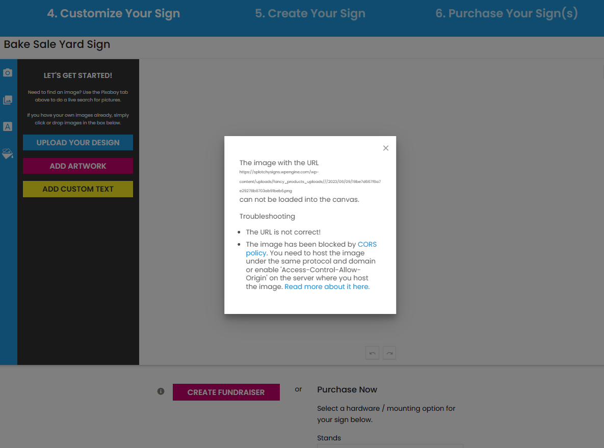
A captured failure in the live editor — an artboard that wouldn't load into the canvas, traced to an image-host/CORS issue. The kind of intermittent break that reads as "user error" until it's reproduced.
They weren't user error. Before I touched product data, SEO, or anything that scaled the catalog, the editor itself had to be trustworthy. So I went hunting.
My role & constraints
I was the sole designer on the platform and the only person doing structured QA on it. I didn't write the plugin code — a third-party agency did — so my job was to find the failures, prove them so a developer could act, and stay in the loop until they shipped.
That meant I couldn't just say "the color picker is broken." I had to show the exact sequence that triggered each bug, confirm it reproduced on the live site and not just my machine, and trace what each editor-level glitch would do downstream in print. The developer and I shared a Monday.com board and met monthly over video — I'd demonstrate the errors and walk the reproduction steps, they'd demonstrate the fixes, and together we'd test solutions. The constraint shaped the skill: when you can't fix it yourself, you learn to document it so precisely that someone else can.
Process
1. The color system didn't agree with itself
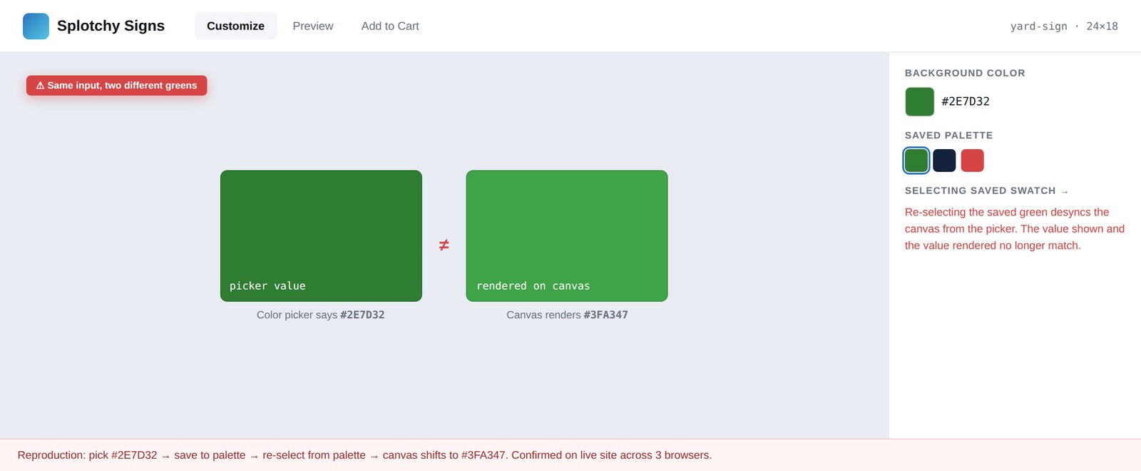
The core defect was a state-consistency bug. The editor offered four ways to set a color — CMYK, RGB, hex, and a color wheel — plus a "save palette" feature. The problem: those inputs didn't stay in sync with each other or with the canvas. You could enter one value and watch a different one render.
The cleanest proof is a matched pair. I set a text element to red by hand — CMYK 0/98/100, hex #ff0400 — and the picker, the swatch, and the canvas all agreed. Then I saved that exact color as a palette named "red," reselected it, and the values stayed byte-for-byte identical while the canvas rendered gray. Same input, different output. Selecting a saved palette silently desynced the render from the values the customer was looking at.
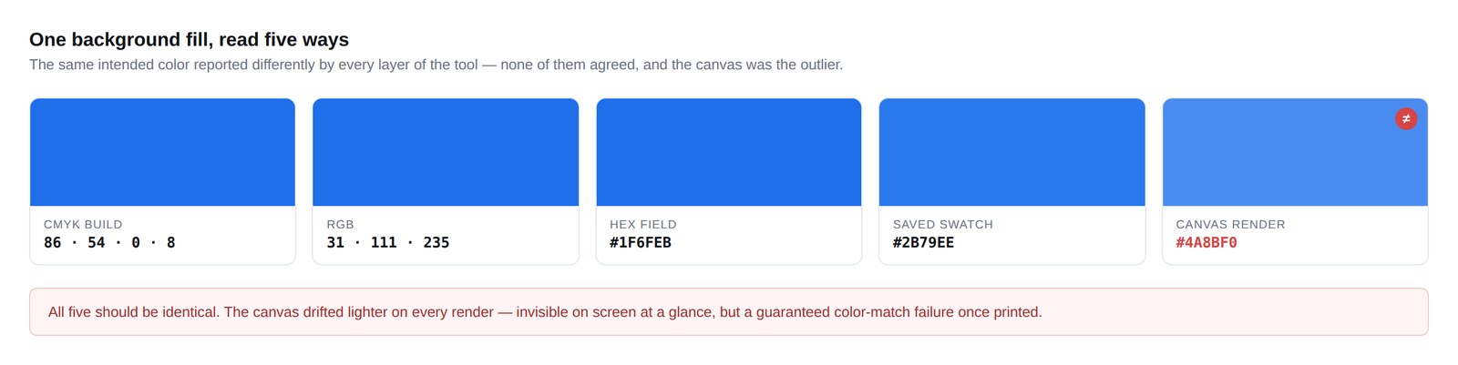
This wasn't a one-off. I reproduced it across font color and background color, on five templates, with directly entered values and with saved palettes. In the worst case every readout disagreed at once — CMYK reading rich black, RGB reading mid-gray, hex reading pure black, the saved swatch showing navy, and the canvas rendering salmon. One element, five answers.
One background fill, read five ways — CMYK, RGB, hex, saved swatch, and canvas never agreed.
One background fill read five ways — and nothing forced the values back into sync.
The reason this mattered isn't aesthetic. A sign customizer that can't render the color a customer picked is a print-production liability — the gap between the on-screen proof and the printed product is exactly where reprints, refunds, and complaints come from.
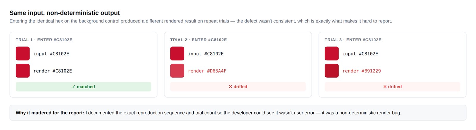
2. Backgrounds that wouldn't hold
The background-color control had its own version of the same disease. Set a background, and the field values and the rendered fill drifted apart the same way the text colors did. I documented it as a separate, independent reproduction so it couldn't be dismissed as a quirk of one control — it was systemic to how the tool managed color state.
The same non-deterministic state, reproduced on the background-color control across three trials.
The same non-deterministic state, reproduced independently on a second control.
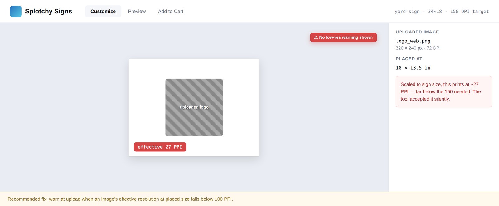
3. Low-resolution uploads went straight to print
Separate from color, I traced a resolution problem. The editor let customers drop a photo into a placeholder and accepted it without checking whether it was high enough resolution to print. I followed one upload all the way through: a small web image dropped into a 12×18″ sign, scaled to fill the bleed, came out at roughly 27 pixels per inch — a fraction of what clean print needs. I confirmed the math in Photoshop and tracked the same image through to the exported print file in Illustrator.
A low-resolution upload scaled to full sign size, printing at ~27 PPI. The tool gave no warning.
An editor behavior that looks harmless in the browser, traced forward to its consequence in production.
This is the through-line in everything I found: an editor behavior that looks harmless in the browser, traced forward to the consequence it creates in production. That trace — symptom to root cause to print impact — is what made the findings actionable instead of just annoying.
Working the fixes
Finding the bugs was half the job. The other half was the loop with the developer. For each finding I wrote the reproduction steps, captured the frames that proved it, and posted it to our shared Monday.com board. Once a month we met over video: I'd demonstrate the live error and walk the exact sequence, the developer would demonstrate what they'd changed, and we'd test the fix together — including the cases where a proposed remedy didn't hold and we had to go back. We weren't handing tickets across a wall; we were diagnosing and testing as a pair, with me owning the customer-and-print side and the developer owning the code.
Anyone can file a bug. The value was documenting it well enough to act on, connecting it to a business consequence, and staying in the loop through to a verified fix.
Outcome
Fixed
Documented defects reproduced and shipped as fixes by the developer
Trustworthy
Editor made reliable enough to build the catalog work on top of
2 adopted
Enhancement recommendations the platform carried forward
The reproductions turned a pile of vague "the tool feels broken" complaints into a short list of specific, fixable defects with clear print consequences — and the ones I documented were fixed. The editor became something I could trust enough to build on top of. Only once the customizer was reliable did I move into the work that scaled the platform — the catalog architecture in Part 2.
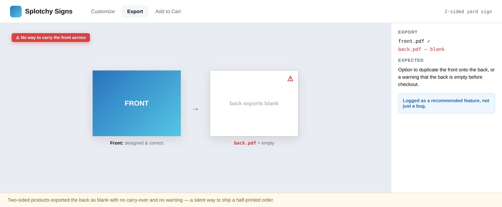
The audit also produced enhancement recommendations the platform carried forward: a duplicate-front-to-back control for two-sided products (which were exporting their second side blank), and recoloring support for uploaded SVGs to match what already existed for text.
Two-sided products exported the back as blank, with no way to carry the front across. Flagged as a recommended feature.
An enhancement recommendation the platform adopted.
Reflection
The most valuable bugs are the boring-looking ones. The color desync never crashed anything — it just quietly produced the wrong result some of the time, and "some of the time" is the hardest failure to pin down and the easiest to ignore. Treating intermittent as a signal rather than noise, and refusing to call something user error until I'd proven it wasn't, is the habit that made the difference. It also taught me to document for the person who has to fix it. That discipline carries into every product problem since.