Produced new artwork and headers, rebuilt product-template artboards for print, refined navigation, and tested orders end to end through the Punchout-to-Ariba setup
Connects to
The reliable editor (Part 1) and the structured catalog (Part 2) were the foundation this built on
The one thing to know
Once the tool was reliable and the catalog was structured, the platform still had to look cohesive and prove it could hand an order cleanly to an enterprise procurement system. That last mile was its own body of work.
Context
A platform can be reliable and well-organized and still not be ready to launch. After the editor was trustworthy (Part 1) and the catalog had a structural spine (Part 2), what remained was the last mile: making the storefront cohesive enough to carry an enterprise client's brand, and proving the whole thing could hand an order to that client's procurement system without breaking.
This is the production-and-integration half of owning a platform — less glamorous than a redesign, but it's the difference between a demo and a launch.
Process · Storefront
1. New artwork and slider headers
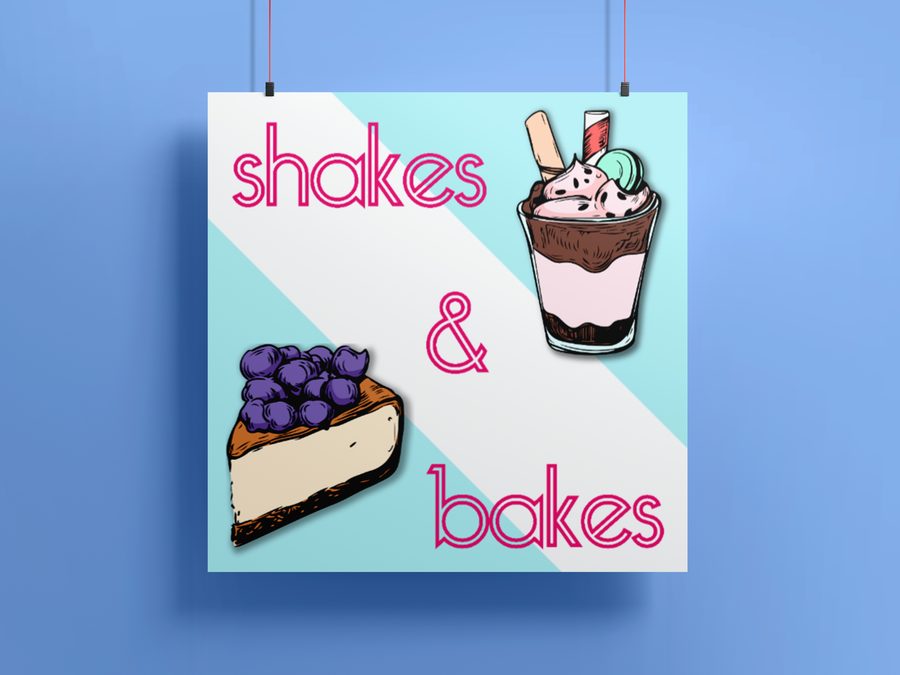
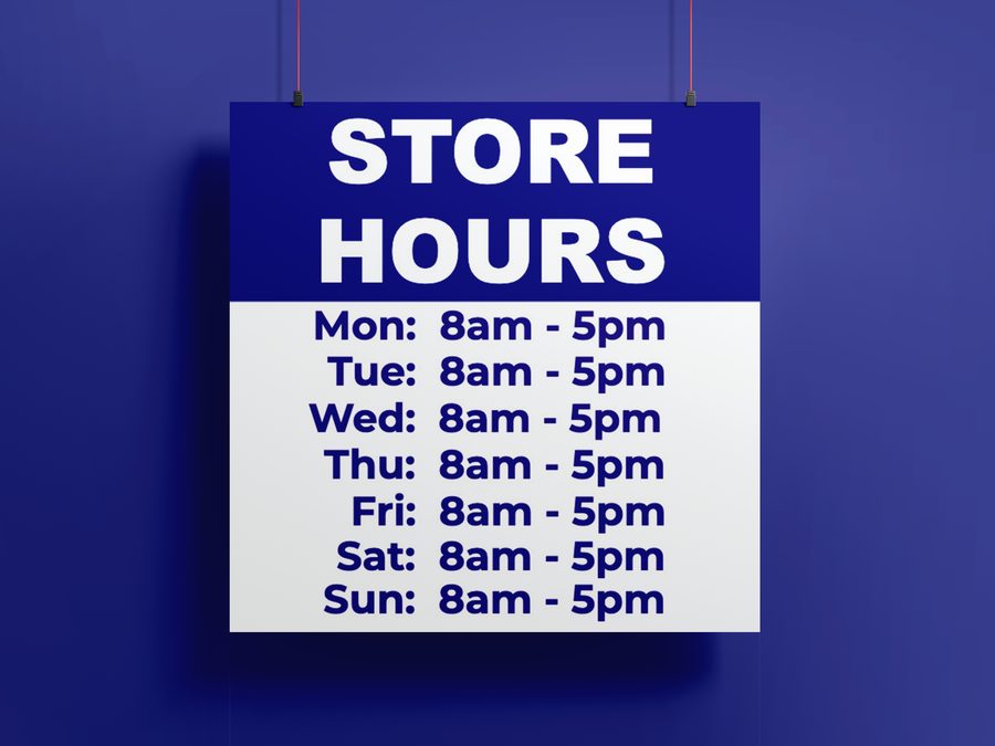
The storefront was carrying a patchwork of mismatched imagery. I produced new artwork across the site and built a set of homepage slider headers — a consistent, branded rotation that gave the front page a single visual voice instead of a stack of one-off banners.
BakeryConstructionStore Hours
New branded artwork I produced across the storefront — a consistent visual voice in place of mismatched one-off banners.
2. A cohesive thumbnail set
Product thumbnails are the first thing a customer scans, and an inconsistent grid reads as an untrustworthy store. I updated the product thumbnails into a cohesive set — consistent framing, crop, and treatment — so the catalog grid looked like one store rather than a collection of uploads.
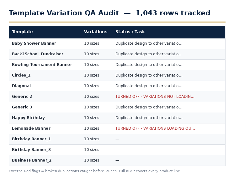
The consistency work behind the grid: a 1,043-row QA audit tracking every template's size variations and flagging broken duplications before they reached customers.
3. Updated filters and categories
Building on the attribute and tag system from Part 2, I refined the customer-facing navigation — updating the filters and category structure so shoppers could narrow by the things they actually shop by (product type, size, use case) and land on the right template faster.
4. Proposed layouts to improve the site's vision
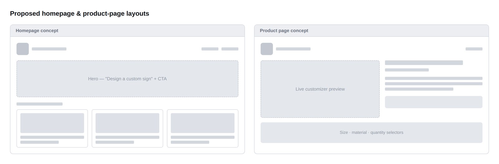
Beyond fixing what existed, I proposed layout directions for where the site could go — concepts for a stronger homepage and product-page experience that pushed the platform past its inherited template toward something that felt designed rather than assembled.
Proposed homepage and product-page layout concepts.
Proposed layouts — a vision for the storefront beyond its inherited template.
Shipped About pageShipped Contact page
Live storefront pages I built out as part of bringing the site to a launch-ready, cohesive state.
Process · Production
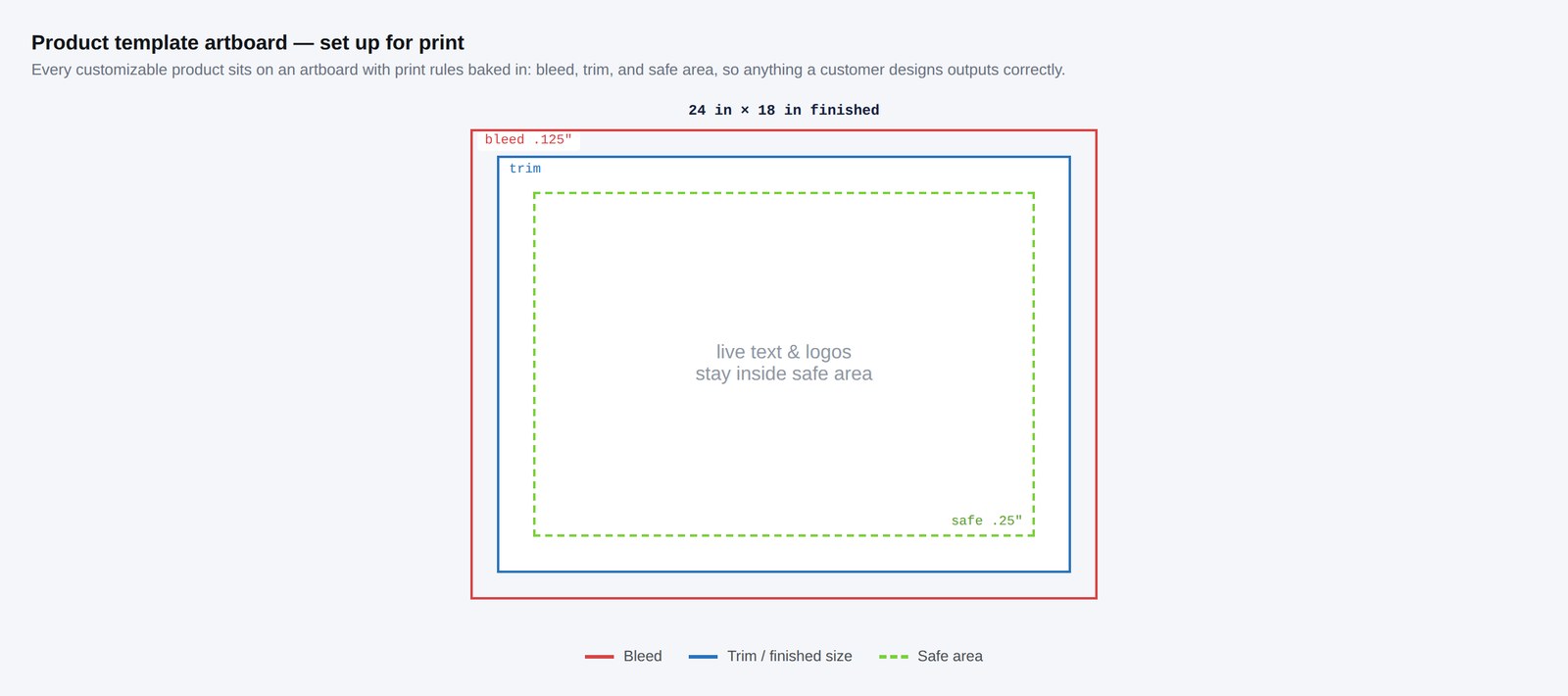
5. Product-template artboards rebuilt for print
The customizer's templates are only as good as the print files behind them. I updated the product-template artboards to reflect real print specifications — correct dimensions, bleed, and safe areas — so what a customer designed on screen translated into a clean, press-ready file. This is where my prepress background did the heavy lifting: the templates had to satisfy the customizer's constraints and the press's at the same time.
A product-template artboard set up for print — dimensions, bleed, and safe area.
Templates rebuilt so an on-screen design exports as a press-ready file.
Process · Enterprise Integration Testing
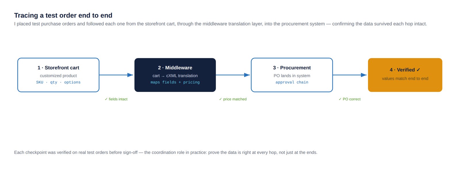
6. Testing orders through the Punchout-to-Ariba setup
The platform's biggest leap was connecting to an enterprise client's Ariba procurement system through a Punchout integration. I participated in the setup and owned the testing from the store side: placing test items and full orders, walking them through the integration during its build-out, and confirming each one translated correctly through the middleware and landed in Ariba as expected.
Integration testing is where assumptions go to die. An order that looks fine in the cart can arrive malformed on the procurement side, and the only way to know is to push real test orders through every stage and check what comes out the other end. I worked through that loop with the developer and middleware provider until orders flowed cleanly.
A test order traced from cart through middleware into the procurement system.
Test orders pushed end to end through the integration setup to verify clean translation. Generic flow — no client-proprietary configuration shown.
A reliable tool and a clean catalog get you to a demo. Proving an order survives the trip into an enterprise procurement system is what gets you to launch.
Outcome
Shipped
Storefront, production templates, and integration testing delivered
Print-ready
Product artboards set up with bleed, trim, and safe area
Verified
Test orders traced cart → middleware → procurement, end to end
Together, this work moved the platform from functional to launch-ready: a storefront cohesive enough to carry an enterprise brand, product templates that exported clean print, navigation that matched the structured catalog underneath it, and a tested order path into the client's procurement system. It's the connective tissue between the foundational platform work and the enterprise store covered in the Meridian Beverage Co. case study.
Reflection
The last mile is its own discipline. It's easy to think the hard part of a platform is the redesign or the architecture; in practice, an enormous amount of the value is in the production and integration work that nobody sees — the artwork that makes a store feel cohesive, the templates that make the print come out right, and the test orders that prove the system actually works before a customer ever places a real one. Owning that last mile is what separates a platform that's "mostly done" from one that's actually live.